Why AI‑Generated Gradients Feel More Harmonious Than Manual Color Mixing
When I sit down to design a keepsake, I almost always start with a feeling. Maybe it is the warmth of a grandmother’s kitchen for a recipe print, or the quiet blues of a long‑distance relationship for a pair of matching art cards. Somewhere between that feeling and the finished gift, a gradient usually appears: a whisper of color moving gently from one emotion to another.
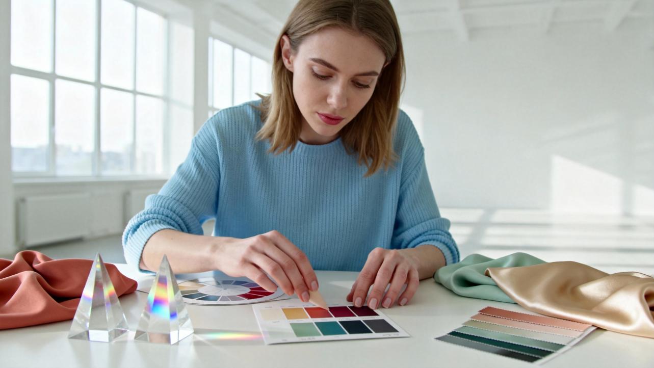
For years I blended those transitions entirely by hand. I still love the smell of paints, the surprise of pigment blooming in water, the way colored pencil softens as you lean in. But adding AI‑powered color tools to my studio changed something important: my gradients became consistently more harmonious, more emotionally precise, and faster to refine, without losing the handmade soul of the final piece.
In this article, I want to walk you through why AI‑generated gradients so often feel more harmonious than manual color mixing, and how you can use them thoughtfully in artisanal, personalized work rather than ending up with generic, “techy” designs.
Gradients, Emotions, And Why Harmony Matters In Keepsakes
A color gradient is simply a smooth transition between two or more colors. In digital design, these transitions can be linear, radiating in a straight line; radial, blooming outward from a center; or conic, rotating around a point, as explained in a practical guide to gradients on a developer community site. Designers use gradients to add depth, movement, and a sense of atmosphere that flat color alone struggles to carry.
Color theory resources from design platforms like Figma and educational articles on AI art both highlight the same core idea: color is not just decoration. Color harmony shapes how we read a piece, where our eye travels, and how we feel while looking at it. Harmonious color combinations can make an interface easier to navigate, a logo more recognizable, and a sentimental artwork more emotionally truthful.
Psychology‑focused research summarized in AI color‑harmony guides adds numbers to what many makers feel intuitively. Larger consumer studies report that:
- A high percentage of people say color is a major factor in whether they choose a product.
- Color alone can boost brand recognition dramatically.
- Specific hues have predictable associations: red is strongly linked to excitement and energy, blue to trust and calm, green to nature and growth.
When you create a gradient for a keepsake—say, a sky shifting from hopeful blush to deep anniversary blue—you are essentially stringing those associations together. If the transition is clumsy, the piece can feel muddy, anxious, or cheap. If the gradient is harmonious, the emotion flows gently from one note to the next, the way a story does.
That harmony is precisely where AI has become a quietly powerful collaborator.

What Color Harmony Really Means (And How Gradients Use It)
Before we talk about AI, it helps to translate a few color‑theory ideas into plain language, because AI tools rely heavily on them.
Color theory articles written for both human and AI artists describe a shared structure.
At the center is the color wheel. It organizes:
- Primary colors, typically red, blue, and yellow.
- Secondary colors, created by mixing primaries: green, orange, and purple.
- Tertiary colors, which are mixes of a primary and a neighboring secondary, like blue‑green or red‑orange.
From this wheel come classic harmony schemes:
- Complementary colors, opposite on the wheel, such as blue and orange, give strong, high‑contrast pairings.
- Analogous colors, neighbors on the wheel, like blue, blue‑green, and green, feel natural and soothing.
- Triadic, split‑complementary, and tetradic schemes combine three or four evenly spaced hues for vibrant but balanced palettes.
Design guides from Figma and AI color‑harmony resources go further and emphasize three subtle properties that matter a lot in gradients:
- Hue: the basic color family (blue, red, green).
- Saturation: how vivid or muted the color is.
- Value: how light or dark it appears.
A gradient is harmonious only if all three of these travel smoothly. If hue shifts but value jumps from bright to dark abruptly, you get harsh bands. If saturation explodes midway, the gradient can feel noisy.
Advanced AI color articles introduce yet another concept: color distance. This is a mathematical way of measuring how similar or different two colors are. AI systems use color distance to spot which colors sit close together (good for calm gradients) or far apart (good for bold ones), and to fill in the “in‑between” stops so the journey from one to another feels natural.
In handmade practice, you do this by eye and experience. AI does it by digesting an enormous amount of visual data.

How AI Actually Builds Gradients
There is a misconception that AI tools simply spit out random colors. In reality, modern AI color systems are doing something closer to what a seasoned painter does mentally, just at a very different scale.
Several sources in the research notes describe how this works.
An AI palette generator called Colormind uses deep learning to study color styles from photographs, films, and popular art. Each day it loads fresh datasets, including things as specific as anime films with carefully controlled palettes or the bright, complementary colors of classic game sprites. When you lock in one or two colors, Colormind fills in the rest based on what it has learned from those visual worlds. If you lock complementary colors at opposite ends of a palette, it tends to generate smooth, pleasing intermediate tones between them.
AI art tools explored in color‑theory articles go further. They are trained on millions of images. During training, they learn how primary, secondary, and tertiary colors are actually blended in realistic scenes—a sunset, a forest, a city at night. They learn color harmony through exposure: which gradients appear in paintings people consider beautiful, which combinations crop up in successful branding, and how color temperature (warm versus cool) shapes mood.
More specialized AI color‑harmony platforms, including those highlighted by SuperAGI and Recraft, break the process into three stages:
Color detection. The AI scans an existing image, logo, or design and identifies dominant hues, measuring color distance between them and their saturation and value. That is how AI can extract a palette from a beach photograph and recognize that ocean blues, warm sand, and leafy greens form a coherent family.
Palette generation. The system then generates a broader palette by applying harmony rules: it finds complementary matches, analogous neighbors, or triadic sets that balance the original colors. For gradients, it pays attention to in‑between steps so transitions feel continuous rather than abrupt.
Optimization. Finally, the AI adjusts saturation, value, and sometimes even texture. Some tools explore multiple harmony schemes, compare them, and nudge colors toward options that are more likely to be perceived as harmonious, often using color distance metrics and learned preferences.
One AI‑focused article even describes how advanced systems analyze context: they do not only look at colors in isolation but consider the purpose of the design, the likely audience, and cultural associations. A palette for a children’s product is handled differently than one for a financial brand, even if both start from similar blues.
When those same engines are used to drive gradients, you are effectively asking a color expert who has studied millions of paintings, interfaces, and photographs to suggest a transition that fits a specific emotion and purpose.
Why AI Gradients Often Feel More Harmonious
In my own gifting studio, the difference between hand‑mixed gradients and AI‑assisted ones became obvious in four ways.
AI bakes in classical color theory automatically
Human‑written guides on gradient design caution against random color picks. They recommend starting with two or three hues that are either neighbors on the color wheel or carefully chosen complements, then adjusting brightness and saturation to keep the transition smooth. AI tools internalize exactly those rules.
The SuperAGI material on AI color harmony explains that AI systems explicitly apply complementary, analogous, and triadic relationships when optimizing palettes. Gradient‑specific articles from Recraft describe how their tools generate effects like vignettes and light leaks while keeping transitions visually balanced. Instead of manually nudging sliders and hoping the midpoints cooperate, you benefit from a system that is constantly checking: do these stops belong together; is the contrast meaningful rather than chaotic.
When I create a gradient background for a personalized vows print, I often start by locking just one ink color—perhaps the navy of the couple’s wedding invitations. The AI suggests supporting hues around it. What I get back is not a random rainbow, but a family of colors that already respect color‑wheel logic. The transition from deep navy to a soft dawn blue feels intentional from the first draft.
AI sees more combinations than any one maker ever will
Gradient‑trend reports from design platforms note that gradients surged in popularity in the late 1990s, returned strongly around 2018, and are predicted to keep rising through 2025. Graphic‑design trend articles and Figma’s massive library of 100 color combinations show just how many nuanced palettes are in active use already.
No single artisan can personally experiment with hundreds of thousands of gradients across every industry, culture, and medium. But AI systems trained on broad datasets have effectively watched gradients work (and fail) in an enormous variety of contexts.
Colormind’s rotating datasets, Recraft’s AI color‑palette guides, and AI‑driven color‑harmony tools described by SuperAGI all leverage this breadth. They recognize that certain transitions—say, muted blue‑gray into soft ivory—reliably feel calm and professional, while neon magenta into lime green feels playful and edgy. When you ask for “a gentle, nostalgic gradient,” you are tapping into that accumulated experience.
That means the gradient behind a hand‑lettered recipe board or custom memory journal can benefit from lessons learned in app design, photography, and packaging, even if you personally never designed an interface in your life.
AI tunes gradients to emotion and behavior, not just aesthetics
Several AI color‑harmony guides stress that color is a behavioral tool, not only a visual one. Summaries of consumer research show, for example, that:
- Red is strongly associated with excitement and urgency, and has been linked with higher conversion rates when used thoughtfully for action buttons.
- Blue is widely chosen when people are asked which color signals trust.
- Color alone can increase brand recognition dramatically, and many consumers say they are more likely to engage with brands that use their favorite color.
AI systems trained on these patterns are not guessing in the dark. When you specify that you want a “calming, trustworthy gradient for a retirement gift print,” the AI is predisposed to suggest cool, gentle hues at the right saturation and brightness, because it has seen that combination used successfully for similar emotional goals.
In my studio, that means the gradient behind a father’s retirement poem leans toward stable blues and soft neutrals rather than loud reds, unless there is a specific story reason to do otherwise. The harmony is not only visual, but emotional: the colors, the words, and the occasion all align.
AI smooths the technical edges that often trip humans
Gradient‑design articles point out several technical pitfalls: banding where the transition steps visibly instead of flowing, muddy midpoints when two saturated colors mix poorly, or low contrast that makes overlaid text hard to read.
Recraft’s guide to gradient effects recommends techniques like adding fine noise to gradients, using gradient meshes for precise control, and previewing gradients on mockups of real objects. Developer guides demonstrate how to use multiple color stops and layered gradients to avoid harsh transitions.
AI tools fold these ideas into their output. Many generate gradients with built‑in texture or carefully spaced stops that minimize banding. Some use advanced gradient meshes under the hood so shading feels realistic and three‑dimensional. When you turn those AI suggestions into physical media—say, by blending colored pencils or alcohol inks—you are tracing a path that has already been smoothed.
In contrast, when you mix manually from scratch, reaching that same level of smoothness can take many test pieces, especially if you are self‑taught.

Where Manual Gradients Still Shine
Even as an advocate for AI‑assisted color, I would not trade away the magic of manual gradients.
There is the tactile joy: the way watercolor blooms unpredictably across cold‑press paper, the way a colored pencil gradient keeps the faint rhythm of your hand, the way a resin pour locks a moment of swirling pigment into something permanent. For sentimental gifts, those traces of process become part of the story.
Manual mixing also forces you to internalize color relationships. When you physically mix red and blue pigments and watch the purple emerge, you are learning in a way no palette generator can replace. That knowledge serves you when AI suggestions are “almost right” but need a human twist.
And uniqueness matters. AI tools, as one SuperAGI guide warns, can develop biases, such as overusing trendy orange‑and‑teal contrasts. If you accept their suggestions uncritically, you risk gradients that look like everyone else’s.
The sweet spot for artisanal work is treating AI gradients as a starting point—a harmonized sketch in color—then interpreting them through your own eye, hands, and materials.

AI Versus Manual Gradients: A Practical Comparison
Here is how I think about the two approaches when planning a personalized piece.
Aspect |
AI‑generated gradients |
Manual color mixing |
Harmony reliability |
Built on formal color theory and massive visual datasets, often harmonious from the first draft. |
Depends on the maker’s experience; can be exquisite, but early attempts may clash or muddy. |
Speed and iteration |
Palettes and gradients appear in seconds; easy to explore many options. |
Exploration is slower and more resource‑intensive, especially with physical media. |
Emotional alignment |
Can be tuned using color‑psychology patterns and even mood‑based prompts. |
Deeply personal and intuitive; may capture individual stories in ways data cannot. |
Uniqueness |
Risk of converging on trendy, familiar looks if not customized. |
Naturally unique; every blend carries the quirks of hand and material. |
Technical smoothness |
Often optimized to avoid banding, harsh jumps, or unreadable contrasts. |
Requires practice and testing to achieve the same smoothness and legibility. |
Learning curve |
Easier for non‑designers to get pleasing results quickly. |
Steeper learning curve; understanding comes with time and experimentation. |
For heartfelt gifts, I reach for both: AI for structure and harmony, my hands for texture and individuality.
Practical Ways To Use AI Gradients In Handmade And Personalized Gifts
If you are a maker or sentimental curator yourself, here are ways to bring AI gradients into your work without losing the handmade essence.
Start with AI, finish with your hands
AI color‑palette guides from platforms like Recraft and Colormind show just how effective AI is at suggesting palettes based on a few inputs: an image, a favorite color, or even a short mood description.
In practice, you might:
Choose a base color. Pick the ink or paint color that already has meaning: the teal of your sister’s favorite sweater, the burgundy from a wedding bouquet.
Use an AI palette generator. Feed that color (or a photo that contains it) into an AI tool that understands color harmony. Tools described in the research can detect dominant colors and generate harmonious companions using complementary, analogous, or triadic rules.
Ask for a gradient. Either lock your base color and let the tool propose surrounding tones, or ask explicitly for a soft gradient that moves from one meaningful hue to another.
Translate to physical media. Recreate the digital gradient with watercolor washes, colored pencil layers, embroidery threads, resin pigments, or whatever medium you love. You are not copying pixels; you are interpreting a color poem.
This is how a simple AI screen sketch becomes the backdrop for a hand‑lettered love letter, a painted memory map, or a custom bookmark set.
Design for the recipient’s story, not just aesthetics
Color‑psychology research summarized in AI guides gives you a helpful compass. When planning a gradient:
Think about the emotion. Is this piece about courage, rest, gratitude, or celebration. Reds and oranges lean toward energy and urgency. Blues and greens lean toward trust, calm, and renewal. Purples can feel luxurious or spiritual; yellows, playful and optimistic when softened.
Use AI to explore subtle variations. Instead of a single “blue‑to‑white” gradient, ask for a palette of deep midnight blue into a slightly gray‑blue and then into a soft ivory, the way Figma’s examples of midnight‑blue palettes do. Each small shift can change the tone from corporate, to dreamy, to nostalgic.
Match gradient direction to the story. Gradient guides point out that direction carries meaning: vertical transitions can suggest growth, horizontal ones calm, radial ones focus on a center. For a “new beginnings” print, a bottom‑to‑top gradient from grounded earthy tones into sky colors can quietly echo the story.
AI helps you explore these nuances quickly so you can spend more time on the handwork that actually makes the gift personal.
Co‑create with your customer using AI
One of my favorite uses of AI gradients in sentimental work is co‑creation.
Ask for a reference image. Invite your client to send a photo that holds meaning: the sunset from their engagement, the forest from a childhood cabin, the colors of a beloved quilt.
Let AI extract the palette. AI tools described in Recraft’s and SuperAGI’s resources can detect the dominant colors in that image and build a palette around them. You then generate gradients inspired by those hues.
Review together. Share a few gradient options with the client and talk about which one feels most like their memory. Even non‑artists can respond easily to gradients: “This one feels calmer,” “That one feels more like that day.”
Translate that choice into a physical gradient in the final piece. Now the color story is literally drawn from their own life.
This approach turns AI into a bridge between someone’s memory and your craft.

A Walk‑Through: From AI Gradient To Heirloom Gift
To make this more concrete, here is how I recently built a personalized anniversary print.
A couple wanted a piece that captured the feeling of their coastal wedding: one loved muted neutrals, the other adored rich, moody blues. They also wanted a hand‑lettered excerpt from their vows in my usual ink‑on‑paper style.
I asked for photos from the day. They sent a shot taken just before sunset, with the sky fading from pale gold into stormy blue over the ocean.
I extracted a palette using an AI tool described in Recraft’s color‑palette guide. The AI detected the warm sand, the dusky gold, and the layered blues of water and sky, then generated a palette that included both muted neutrals and deep, cool tones. Behind the scenes, it leaned on color‑harmony rules and color‑distance calculations, but what I saw was a lovely row of swatches.
Then I asked the tool for a gentle vertical gradient inspired by those hues. It responded with several, all moving from a warm, sandy base through soft gold into the deep blues the couple had requested. Because the AI had been trained on photography and design, the brightness and saturation shifted gradually; there were no harsh midpoints.
I chose one that felt right and translated it to watercolor on heavyweight paper. The digital gradient became a guide for where to lay the first wash of sandy beige, how far to pull it up before introducing gold, when to start weaving in ultramarine at the top. The physical piece was not a pixel‑perfect copy, but an interpretation.
Finally, I lettered their vows over the dry gradient in deep navy ink. The result felt seamless: the words, the colors, and the memory from their photograph all sang the same song. AI did not make the gift less handmade; it simply gave me a more harmonious, emotionally tuned sky to write upon.
Keeping AI Gradients Soulful: Pitfalls To Watch For
Using AI gradients in sentimental work is not entirely risk‑free. Gradient guides, trend reports, and AI color‑harmony articles point to a few patterns worth watching.
Over‑trendiness. Gradient trend reports highlight how popular bold, neon “aurora” gradients have become, especially online. AI tools trained on recent work can lean heavily in that direction. If every piece you make uses intense magenta‑to‑cyan sweeps, your gifts may feel more like app splash screens than heirlooms. When using AI, consciously steer toward palettes that match your recipient and medium, not just what is fashionable.
Low contrast with text. Accessibility‑focused design articles remind us that gradients can easily make text hard to read. AI tools can help by suggesting palettes with sufficient contrast, but they are not perfect. When overlaying important words—names, vows, dates—test them on top of your gradient at the actual size. If any part of the text falls over a mid‑tone area and disappears, adjust the gradient or add a subtle overlay wash.
Banding and artificial smoothness. Some AI output looks too perfect: transitions are so mathematically smooth that, once printed, they feel plastic rather than human. Gradient experts often add tiny amounts of noise or grain to break that perfection. You can do the same in physical media: a light spatter of paint, visible brush strokes, or layered pencil textures make the gradient feel more human and less sterile.
Bias toward certain palettes. SuperAGI’s color‑harmony guide warns about AI leaning into common schemes like orange and teal because they appear frequently in training data. If you notice your AI tool suggesting similar gradients over and over, treat those as the “top of the pile,” not your only choices. Nudge prompts toward less typical moods, or manually swap out a stop based on your own color knowledge.
The remedy for all of these pitfalls is the same: let AI do the initial harmonizing, then apply your human judgment as a sentimental curator. Ask whether this gradient genuinely suits this person, this story, this material.
FAQ: AI Gradients In Handmade, Sentimental Work
Is using AI to build gradients “cheating” if I sell handmade or personalized gifts?
In my view, no. AI color tools are closer to a very knowledgeable assistant who lays out paint chips on your table. The final gradient in a physical artwork still depends on your hand, your paper or fabric, your interpretation. Buyers of artisanal gifts care deeply about intention and craftsmanship; using smart tools to make your colors more harmonious and emotionally aligned supports that, rather than undermining it.
Will AI make my gradients look like everyone else’s?
It can, if you accept its first suggestion every time. That is why trend reports and AI guides emphasize combining AI with manual refinement. Think of the AI output as a harmonized draft. Once you have it, adjust hues slightly to match the recipient’s story, alter saturation to fit your medium, and embrace the variation that comes from brushes, pens, or stitches. Your hand and your narrative choices keep each piece unique.
Which kinds of AI tools should I look for as a non‑designer?
The research points to three especially helpful categories. Palette generators like Colormind learn from photographs and art to suggest harmonious color sets and gradients. AI design platforms like Recraft or those highlighted by SuperAGI combine color‑harmony models with image analysis so you can feed in a photo or a mood prompt. Design tools from companies such as Adobe and Figma integrate AI‑powered palette suggestions directly into their color pickers. Choose options that let you lock specific colors, extract palettes from images, and preview gradients against text or mockups, so you can keep control.
When you work with keepsakes and heartfelt gifts, you are really working with stories. AI‑generated gradients, at their best, do not replace your storytelling; they help you choose smoother, more resonant transitions between emotional chapters.
Treat the AI as a quiet color confidante. Let it suggest harmonies grounded in color theory, data, and contemporary practice. Then bring those harmonies into the real world with your brushes, your inks, your threads, and your heart. That is where a gradient stops being an effect and becomes a memory someone will hold onto for years.
References
- https://www.computerscience.uchicago.edu/news/exploring-3d-paintbrush-an-ai-that-colors-with-words/
- https://admisiones.unicah.edu/browse/Igeqyj/5OK104/ColorTheoryAnEssentialGuideToColorFromBasicPrinciples.pdf
- https://dspace.mit.edu/bitstream/handle/1721.1/159253/3689050.3705989.pdf?sequence=1&isAllowed=y
- http://colormind.io/
- https://medium.muz.li/using-gradients-the-right-way-878d797bc600
- https://blog.prototypr.io/design-with-gradients-fdba5ec856d4
- https://uxdesign.cc/design-better-gradients-dos-and-donts-3e6cd34ae26e
- https://deepdreamgenerator.com/blog/color-theory-in-ai-art
- https://dev.to/kolort/understanding-color-gradients-in-digital-design-a-comprehensive-guide-5g0l
- https://www.eggradients.com/blog/how-ai-shapes-gradient-trends-in-modern-ui-ux-design
