Techniques for Identifying Detail Enhancement in Photos
When you are turning a favorite snapshot into a keepsake print, a framed piece of wall art, or a custom photo charm, the tiniest details suddenly matter. Threads in a wedding dress, the texture of your grandmother’s hands, the sparkle in a child’s eyes: these are the details that make a handmade gift feel deeply personal. At the same time, modern cameras and editing apps are very good at faking detail. Sliders with names like Sharpen, Clarity, Texture, Structure, Dehaze, and Detail can make almost any photo look “crisp” at first glance, but sometimes at the cost of natural skin, gentle light, and long-term print quality.
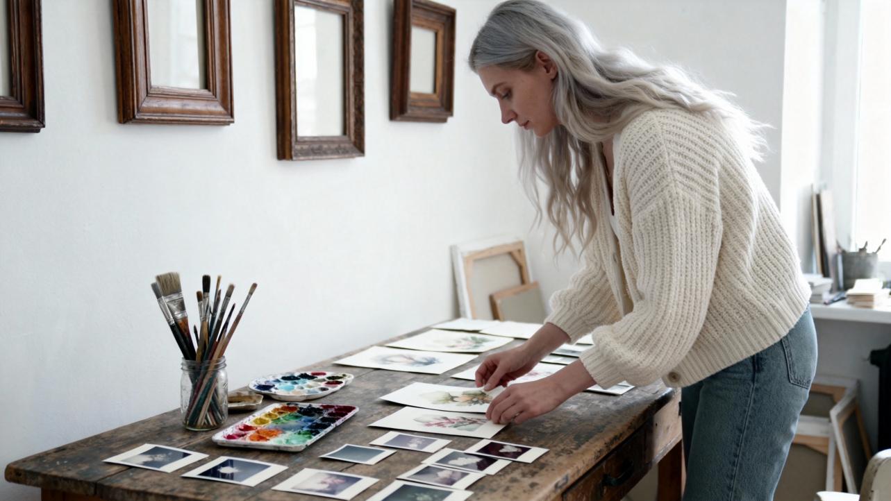
As someone who prepares images for sentimental gifts every day, I spend a surprising amount of time simply looking for evidence of detail enhancement. Before I commit a photo to fine art paper, canvas, wood, or metal, I want to understand what has been done to it and whether those choices will still feel beautiful when the image is enlarged and lived with for years.
This article will walk you, in warm but practical terms, through how to recognize different types of detail enhancement in photos, how to tell when it is tasteful or overdone, and how to talk about it when you are commissioning or creating artful photo gifts.
Sharpness Versus Detail Enhancement
Before you can spot detail enhancement, it helps to separate two related ideas: true sharpness and enhanced detail.
Sharpness, in the classic photographic sense, is about the clarity of fine detail that the camera actually captured. Adobe educator Kenneth Hines Jr. describes sharpness as the visibility of fine detail, governed by focus, lens quality, shutter speed, camera stability, and depth of field. Articles from Photography Life and Great Big Photography World echo this idea and talk about “tack sharp” photographs where edges are clean, one-pixel-wide, and free of blur. Achieving this kind of sharpness depends on technique: choosing the right focus point, using an appropriate aperture (often around the lens’s “sweet spot,” frequently near f/8–f/11 for many lenses), and keeping the camera steady with a tripod or sufficiently fast shutter speeds.
Detail enhancement, by contrast, is mostly about how the image is processed after capture. Digital tools increase local contrast, emphasize edges, or reveal micro-textures, sometimes even when the original file is slightly soft. Clarity sliders, Structure controls, high-pass sharpening layers, Dehaze, and other local contrast tools all fall into this category. An article from Digital Photography School defines Clarity as a local contrast adjustment focused on midtones that increases texture and perceived sharpness without relying purely on traditional edge sharpening. Capture One’s David Grover explains a similar tool called Structure using a lovely analogy: if Clarity enhances the trunk and big branches of a tree, Structure enhances the smaller branches and leaves, while traditional sharpening works at the finest level, on the details in a single leaf.
In practice, that means a photo can look “highly detailed” because of processing, even if the camera file was merely average. When you are evaluating a photo for a keepsake gift, it helps to ask two questions in your mind. First, does this image feel in focus where it needs to be? Second, has the detail been pushed in a way that still feels like the person or scene I remember?
The Main Detail Enhancement Tools And How They Look
Many of the tools photographers use to enhance detail leave distinct fingerprints. Learning to recognize those signatures will make you much more confident when you are choosing images for important gifts or doing your own edits.
Here is a quick comparison that you can refer to as you read the sections that follow.
Tool or concept |
What it actually does |
Visual clues it has been used |
Sharpening |
Increases contrast right at edges to define lines and small details |
Halos along high-contrast edges, crunchy texture, noise |
Clarity / Texture |
Boosts local contrast in midtones and texture |
Extra “pop” in fabric, stone, hair; skin can look gritty |
Structure (Capture One) |
Enhances fine textures one step smaller than Clarity |
Fur, foliage, and fabric look more defined and dimensional |
Dehaze |
Adds contrast and saturation to cut through atmospheric haze |
Skies and distance look denser, sometimes overly blue |
Multi-scale detail enhancement |
Enhances detail at several scales while trying to avoid halos |
Overall “HD” look with clearer edges but still natural tones when done well |
Sharpening: The Classic Detail Boost
Sharpening is the oldest and most familiar form of detail enhancement. Tutorials from Photography Life and others recommend leaving in-camera sharpening low and performing sharpening in post-processing instead, because global sharpening built into the camera tends to be crude and difficult to adjust later. In software such as Lightroom or Photoshop, sharpening increases contrast right along edges: dark pixels just next to a bright edge are made darker, and bright ones brighter, making the edge appear crisper.
When you are inspecting a finished photo, you can often identify heavy sharpening by zooming into hard edges. Look at the line where a dark coat meets a bright sky, or where a tree trunk cuts against a bright background. If you see a light outline on the bright side of the edge or a dark outline on the shadow side, that is a sharpening halo. Over-sharpening also exaggerates noise, especially in darker midtones. Grain in a shadowy wall or sky may look speckled and harsh rather than smooth.
Used well, sharpening can be almost invisible. Guides from Photography Life and Great Big Photography World emphasize a careful approach: apply moderate sharpening and use tools like masking so that only important areas, such as eyes or foreground rocks, receive the strongest effect. Lightroom, for example, lets you hold a modifier key while adjusting the Masking slider so sharpening clings to edges and leaves smooth areas like skies or skin relatively untouched.
Clarity and Texture: Midtone Micro-Contrast
Clarity and Texture sliders, described in Adobe’s beginner guides and Digital Photography School’s work on the Clarity slider, are a more modern form of detail enhancement. Instead of simply emphasizing edges everywhere, they increase local contrast primarily in midtone areas and within small neighborhoods of pixels.
Visually, increasing Clarity gives an image more “punch.” Cityscapes, architecture, and landscapes often benefit from added Clarity and Texture; bricks look more defined, tree bark looks dimensional, and distant mountains gain presence. Kenneth Hines Jr. mentions using strong sharpening in combination with masking, and then adjusting Texture and Clarity to decide how much micro-contrast to show in different parts of an image.
However, these very same sliders can make portraits look harsh if overused. Digital Photography School advises lowering Texture for skin while using moderate Clarity for the overall scene. When you evaluate a portrait that feels “over-processed,” look closely at cheeks, under eyes, and around the mouth. If skin pores and fine lines look as sharp as tree bark or concrete, the photographer has probably applied too much global Clarity or Texture instead of using more gentle, selective adjustments.
Structure and Local Contrast
Capture One’s Structure control, and plug-ins like Topaz Clarity, are cousins of the Clarity slider but often give you finer control over which scale of detail is improved. The Digital Photography School article on Topaz Clarity notes that it separates contrast into multiple scales, from micro to high-level contrast, with individual sliders. That means an editor can enhance fine texture while keeping larger tonal transitions smooth and natural.
In David Grover’s lemur example, he uses local adjustments to darken distracting bright areas, brighten the eye, and then adds Structure to the entire background layer. The result is fur that feels lush and detailed without simply cranking up sharpening globally. When he compares Structure at a value of forty to Structure at zero, the difference is apparent in fine hairs and subtle textures rather than in hard halos.
When you are trying to identify Structure or similar tools in a finished photo, pay special attention to textured subjects such as fur, foliage, or knitted clothing. If those surfaces have a very tactile, almost three-dimensional quality, yet edges remain free of halos and noise does not jump out, there is a good chance a Structure or multi-scale contrast tool has been used thoughtfully.
Dehaze and Haze Removal
Dehaze tools were designed to cut through atmospheric haze and low contrast caused by fog, humidity, or distance. Photography Life’s post-processing guide explains using the Dehaze slider to strengthen contrast in the sky and distant buildings, while warning that values above roughly twenty-five can make images look unnatural and over-saturated. The guide also points out that Dehaze can shift colors, particularly toward blue, requiring a revisit to white balance afterward.
From a viewer’s perspective, heavy Dehaze has a distinct look. Distant hills or buildings that should recede gently may appear abruptly crisp and dark. Clouds can look overly dramatic, and the entire sky may take on a deep, almost metallic blue. If the foreground feels reasonably natural but the distance looks as if a polarizing filter and contrast slider were pushed aggressively together, Dehaze has probably played a role.
For sentimental gifts, some families love a bold, epic sky behind their cabin or favorite beach; others prefer something that feels closer to what their eyes remember. The key is noticing that Dehaze has altered the mood so you can decide whether it fits the story you want the gift to tell.
Advanced Multi-Scale Detail Enhancement
Behind the friendly sliders in consumer software lies a deep well of research in image processing. A brief review of image detail enhancement techniques notes that many classic methods simply alter gray levels uniformly across the entire image, which can produce undesirable results when local detail varies. To address this, researchers have developed content-adaptive, edge-preserving techniques such as bilateral filtering, guided filtering, anisotropic diffusion, and multi-scale decompositions.
One study presented in SPIE describes a multi-level detail enhancement method based on guided filtering. The process repeatedly smooths the image to create several background layers, subtracts these from the original to obtain detail layers at different scales, and then recombines the details using adaptive weights. The authors report improvements in metrics like average gradient and spatial frequency, while keeping edges clear and visual effects natural.
Another paper on chest X-ray analysis for COVID-19 uses a combination of total variation filtering and gamma correction as a pre-processing step before deep learning. By enhancing relevant structures in the lungs and suppressing noise, they achieved better classification accuracy and sensitivity than without enhancement.
You do not need to remember these specific algorithms when you choose a photo for a birthday album or anniversary canvas. The important takeaway is that many modern cameras and apps apply sophisticated detail manipulation behind the scenes. A photo from a recent phone might look “hyper realistic,” not because the lens is perfect, but because small-scale detail has been separated, boosted, and blended in a carefully designed way.
Practical Ways To Spot Detail Enhancement
Now that you have a sense of the tools, how do you actually recognize detail enhancement in the wild, especially when you only have the final image and not the original file?
Start by zooming in or looking closely at edges. If you are on a screen, view the image at one hundred percent. If you are holding a print for a handmade framing project, use normal viewing distance and then move a bit closer. Photography Mad and other sharpness guides suggest this kind of close inspection even when checking in-camera, and the same habit works when evaluating finished photographs.
Pay special attention to high-contrast borders, such as a person against a bright sky, tree branches against snow, or building edges at sunset. If you see bright outlines or dark rims hugging those edges, sharpening or high-pass filters have likely been applied. A touch of halo might be acceptable in a gritty street print, but in a tender newborn portrait it can feel jarring.
Next, study midtone textures: fabrics, hair, beards, tree bark, and pavement. If everything has the same degree of crispness, including areas that normally feel soft, strong Clarity or Structure was probably used globally. Adobe’s guidance suggests boosting Texture and Clarity more generously in landscapes, and softening Texture for skin; when you see skin and stone treated identically, that recommendation has been ignored.
Then, look at skin and faces, especially in gifts that will be displayed in intimate spaces like bedrooms or hallways. The beginner critique in a photography group highlighted the idea that perceived sharpness is heavily influenced by local contrast, not just focus. Too much local contrast in skin can create a brittle, aged appearance, even in young subjects. Fine pores, tiny bumps, and under-eye texture can become more prominent than the expression itself. When that happens, the detail enhancement is telling the wrong story for a sentimental print.
Also check the shadows and smooth backgrounds. Lightroom and Photoshop experts consistently warn that over-sharpening will increase noise, especially where tonal variation is small. If dark walls, evening skies, or shadowy corners look gritty or speckled, a mix of high sharpening and local contrast adjustments has probably been pushed a bit too far.
Finally, notice the overall mood. Canva’s guidance on image enhancement emphasizes that brightness, contrast, and saturation should correct exposure and strengthen composition, not transform the scene beyond recognition. If blues look neon, greens electric, and every line is biting, the combined effect of saturation, contrast, and detail tools can overshadow the original feeling of the moment.

Tasteful Detail Enhancement Versus Overdoing It
Detail enhancement is not the enemy. In fact, a modest amount is almost always necessary. RAW files from cameras, as noted in Photography Life’s post-processing article, often look flat and dull before they are processed. Slightly increasing brightness, adding global contrast, applying gentle Clarity, and sharpening the subject are part of crafting an appealing image. The key is balance.
Educators from Digital Photography School and Petapixel remind us that strong photography begins with composition and light. Detail enhancement can polish the result but cannot fix weak framing or bad light. When you see an image that feels alive, with clear subject placement, pleasing light, and gentle but present detail, you are probably looking at a thoughtful collaboration between capture and processing.
By contrast, overdone detail enhancement tends to flatten the visual hierarchy. Every surface competes for attention. That can be thrilling for a gritty city skyline where you want every brick and window to shine, but it can feel exhausting in a quiet family portrait. In critique communities, mentors often talk about learning when to stop. If you find yourself noticing the processing before the person or place, it has likely gone too far.
Here is a way to think about it that often helps clients in my studio. Imagine the photo as a conversation at a dinner table. In a well-balanced image, the subject speaks clearly, supported by the setting. In an over-enhanced image, the detail is the guest who talks too loudly, drowning out the story.

Choosing Detail Levels For Artisanal Photo Gifts
When you are creating handcrafted gifts from photos, you are making a long-term commitment to how those details will live on someone’s wall, desk, or wrist. Prints often emphasize detail and flaws differently than screens do, so this is a moment where an artful, sentimental eye matters.
Capture One’s David Grover notes that he can sometimes push Structure a little more for prints than for screen, because print can benefit from extra texture to counter the slight softening that occurs on paper. At the same time, oversharpening halos that were only mildly visible on a cell phone screen can become obvious on a large canvas. Photography Mad recommends checking sharpness at one hundred percent on the camera’s LCD so you can correct issues before leaving the scene; the same principle applies when you prepare files for printing.
If you are working with a professional photographer or editor for your gift, do not hesitate to use language that references detail. You can say that you prefer a softer, more painterly look for grandparents’ portraits, with gentle skin and natural eyes, or that you would love extra crispness in a cityscape intended for a home office. Referencing sources like Adobe or Capture One, you can even mention that you would like Clarity and Texture kept subtle on faces while allowing more Structure in hair, clothing, and background textures.
When you are editing yourself using tools such as Lightroom, Capture One, or Canva’s editing suite, adopt a “less is more” philosophy and then build upward. Canva suggests using brightness, contrast, saturation, and related sliders mainly for subtle corrections. That advice extends nicely to clarity and sharpening. Make a small adjustment, look away for a moment, and then come back with fresh eyes. If you can clearly see the slider’s effect rather than simply feeling that the scene looks more like your memory, it is often wise to pull back a bit.
For small photo jewelry or ornaments where images will be seen at close distance but small size, prioritize natural faces and smooth tones over maximum texture. For large wall pieces that will usually be viewed from several feet away, you can allow a little more micro-contrast in architectural details, landscapes, and objects, as long as skin and skies remain graceful up close.

A Gentle Visual Checklist For Sentimental Prints
When clients bring me a folder of images and ask which will make the best heirloom print or handcrafted album, I often walk them through a simple visual checklist, not as a rigid recipe but as a way to tune their eyes.
Begin by asking what part of the image you care about most. Maybe it is a face, intertwined hands, a beloved pet, or the texture of a wedding dress. Zoom in or look closely at that area first. Check that it is truly in focus and reasonably sharp in the camera sense. No amount of detail enhancement can fix missed focus or motion blur, as both Adobe’s guides and Mike Smith’s practical tutorial on sharp photos remind us. You can soften a sharp image later, but you cannot recover detail that was never there.
Next, scan for halos and distracting outlines along major edges. If you see them immediately, ask yourself whether they serve the story. A slightly edgy look might be acceptable in a dramatic portrait or urban scene but could be distracting in a quiet family moment.
Then, examine skin and smooth tones under normal viewing distance. If you find your eyes lingering on pores, wrinkles, or speckled noise instead of expressions, consider choosing a different version of the photo or asking for a softer processing pass. Digital Photography School and Adobe both recommend reducing Texture locally on skin while keeping some Clarity in the overall image; a portrait that ignores that distinction is not ideal for a sentimental gift.
Finally, step back and consider the overall harmony of light, color, and detail. Composition and lighting, as emphasized by Digital Photography School and Petapixel’s composition articles, should still lead the eye. Detail enhancement should support that path, guiding attention to faces and important objects while gently de-emphasizing background distractions. If you feel at peace looking at the photo, with your attention flowing naturally to the heart of the story, the balance is probably right.

Brief FAQ
How can I tell if a phone photo has enough real detail for a large print?
Look at the image at full size on a good screen and zoom in to one hundred percent. Check eyes, hair, and key textures such as clothing or foliage. If they look reasonably clean and defined before you add any extra sharpening or Clarity, the file likely has enough genuine detail. Smartphone-focused advice from Adobe notes that cleaning the lens, holding the phone steadily with both hands, and moving closer instead of over-relying on digital zoom all help capture more real detail, which in turn makes gentle enhancement more effective and safer for enlargement.
Are AI and advanced detail enhancement tools safe for keepsake photos?
Research in IEEE Signal Processing Letters, SPIE conference proceedings, and medical imaging journals shows that advanced filters and total-variation-based enhancement can reveal subtle structures and improve automated analysis. In creative work, similar ideas power many “Auto Enhance” and AI detail tools in photo editors. Used modestly, they can absolutely help, especially when a photo is slightly flat. The key is to review the result with a human, emotional eye. If the person in the photo still looks like themselves and the mood matches your memory, the technology is serving your story rather than rewriting it.
Should I always avoid strong detail enhancement?
Not necessarily. For certain subjects—city skylines at night, rugged mountain ranges, architectural details, or product shots for a handcrafted item—strong clarity, structure, and sharpening can be wonderfully expressive. The practical advice from Canva and Digital Photography School is to think about intent. For sentimental portraits and family moments, err on the side of softness and natural texture. For bold, decorative pieces or images where texture is the star, you can embrace stronger detail, as long as you are comfortable with how it will feel on the wall years from now.
In the end, identifying detail enhancement in photos is less about catching someone “cheating” and more about understanding the language of your images. When you can recognize the difference between captured detail and added detail, you are better equipped to choose, edit, and gift photographs that honor the real, imperfect, beautiful moments they represent. And that is the kind of quiet care that transforms a simple print into a cherished, artful keepsake.
References
- https://www.academia.edu/79429672/Image_Detail_Enhancement_Techniques_A_Brief_Review
- http://citeseerx.ist.psu.edu/viewdoc/download;jsessionid=F2EAAEDE32EDEB19E95043D47C8C9491?doi=10.1.1.678.1984&rep=rep1&type=pdf
- https://ui.adsabs.harvard.edu/abs/2024SPIE12969E..18T/abstract
- https://pmc.ncbi.nlm.nih.gov/articles/PMC9340712/
- https://www.umsl.edu/~kangh/Papers/kang_eg14.pdf
- https://www.princeton.edu/~cuff/ele201/kulkarni_text/filtering.pdf
- https://www.sci.utah.edu/~gerig/CS6640-F2014/Materials/dip3e_chapter_03a.pdf
- https://photographylife.com/five-easy-steps-to-improve-your-photos-in-post-processing
- https://www.apcwildlife.com/blog/sharpness-in-photography
- https://beautysurroundsyou.com/tips-techniques-sharp-photographs/
