The Safety and Appeal of AI-Designed Baby Product Patterns
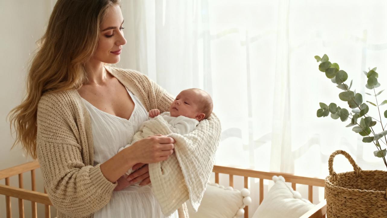
When I sit down with a new parent to dream up a baby quilt, a first-swaddle pattern, or a set of keepsake onesies, we almost always end up in the same conversation. They have fallen in love with some adorable AI-generated print they saw in a shop or online. At the same time, they wonder quietly: is this actually safe for my baby’s little eyes, heart, and mind? Or is it just clever technology dressed up as cuteness?
As an Artful Gifting Specialist and Sentimental Curator, I live exactly in that intersection between warm, handcrafted keepsakes and the very modern reality of AI-powered design. I use AI tools the way earlier generations used sketchbooks and tracing paper: to explore color stories, motifs, and layouts faster than my hands could ever keep up, then translate the best ideas into real fabric, real stitches, real heirlooms.
In this article, I want to walk you through what we actually know about color, pattern, and infant development, how AI pattern platforms work, and what “safe” truly means when we talk about AI-designed baby product patterns. My goal is simple: to help you feel confident choosing or creating pieces that are both technologically smart and deeply gentle for a growing child.
What Are AI-Designed Baby Product Patterns, Really?
When we talk about AI-designed patterns for babies, we are usually referring to generative systems that can create artwork for textiles, clothing, nursery decor, and accessories on demand. Platforms like MYTH AI, for example, can generate unique kids’ and baby fashion patterns in a matter of seconds, and can produce hundreds of designs across joggers, onesies, bedding, home textiles, and more in one go. Their models learn from large collections of existing kidswear, trends, and reference imagery, then recombine motifs, colors, and textures to produce new, original pattern files.
Under the hood, deep learning models analyze things like color psychology, fabric textures, and motif preferences such as animals, stars, florals, or clouds. According to the platform’s own description, designs can be optimized for specific age groups, so a newborn pattern might lean toward softer palettes and simpler forms while a preschool print might embrace a bit more complexity and contrast.
For brands and makers, this workflow can be dramatically faster than traditional sketch-by-sketch processes, sometimes described as up to 90 percent faster. AI pattern tools also support sustainability measures: by testing ideas digitally and planning yardage more precisely, some systems report reducing textile waste by roughly two-thirds through digital prototyping and better pattern planning.
So AI is not stitching your baby’s blanket. It is acting as a supercharged idea generator and layout assistant, handing human designers and artisans a stack of possible artworks to refine, edit, and bring into the physical world.

Why AI Baby Patterns Feel So Irresistibly Cute
Parents are not imagining it: AI-generated baby patterns can feel almost suspiciously tailored to your taste. There are a few reasons for this.
First, AI is good at remixing motifs in ways that feel both familiar and fresh. A designer can ask for “gentle forest animals in a storybook style, in a cozy fall palette” and explore dozens of variations instantly. Because these systems are trained on huge libraries of visual references, they can echo beloved aesthetics without copying any single artwork.
Second, AI pattern platforms often bake in color-psychology rules. MYTH AI, for instance, explicitly factors color psychology into its generative engine, aiming for playful, soft, comforting designs that feel good to both children and caregivers. That might mean softer hues for baby sleepwear, slightly more saturated tones for toddler play leggings, or gently contrasting motifs that invite exploration without shouting for attention.
Third, generative AI is increasingly used across the baby product and toy industry, not only for patterns but also for text, image, and video editing. A trade magazine feature on generative AI in this sector notes that these tools are now central to product presentation, helping brands craft visuals and stories that help parents build an emotional bond with items before they ever touch them. When pattern design, product photography, and even marketing copy are all harmonized through AI, the result can feel very cohesive and appealing.
The magic, however, is not just in how cute something looks. It is in whether that cuteness is also safe and developmentally wise.

How Babies Actually See Color and Pattern
Every conversation about pattern safety should start with how babies see, because their visual world is very different from ours at first.
Several child-focused sources, including The Bump and R for Rabbit, describe a similar developmental arc. Newborns mainly see in shades of black, white, and gray, and they see best at about 8–12 inches from their face, which is roughly the distance to a caregiver’s eyes during feeding. High-contrast patterns are easiest for them to detect in those early months and help stimulate the optic nerve, which grows rapidly in the first three years.
Around three to four months, babies begin to process more color, often first noticing strong reds, blues, yellows, and greens. By about six months, their color vision is close to an adult’s, and they can appreciate a full spectrum of hues. At that stage, they are more capable of enjoying softer tones and more nuanced color relationships.
At the same time, research suggests that babies and preschoolers are extraordinarily sensitive to visual environments. A pilot study with three- to four-year-old preschoolers compared structured play tasks on highly colorful surfaces versus plain white ones. The colorful surfaces, covered in saturated images and sharp contrasts, led to more off-task behavior and disruption during activities like puzzles and construction play. A similar message comes from design guidance on color and texture in care environments, where authors note that very bright primary reds, yellows, oranges, bold patterns, and strong contrasts can overstimulate infants, disturb sleep, and cause restlessness if overused.
The takeaway is not that color is dangerous. In fact, humans take in the vast majority of sensory information through vision, which makes color a powerful tool for supporting learning and emotional growth. The point is that the way we arrange color and pattern around babies matters deeply.

Warm, Cool, and Neutral: What Color Studies Tell Us
Many baby pattern decisions come down to warm versus cool versus neutral palettes, and here we do have a rich body of practical knowledge.
Warm hues such as red, orange, and yellow tend to be energizing. Multiple baby-focused articles describe red as stimulating, exciting, and appetite-boosting, which is exactly why it is so common in food branding and active toys. Yellow is often associated with liveliness, intelligence, and cheerfulness, while orange can feel friendly and inviting. Research into traditional color use in children’s products, including a detailed study published in BMC Psychology using colors extracted from Turkmen carpet patterns, found that preschool children often favor warm colors like red and yellow over cooler hues, with parental surveys confirming that these colors are emotionally engaging.
However, warm colors are also the ones most likely to cause overstimulation if they dominate a space. Red has been linked to higher heart rate and arousal; bright, intense yellows can feel stressful when overdone; and high-saturation warm patterns across walls, floors, and furnishings can quickly overload a young child’s still-developing attentional system.
Cool colors—especially soft blues, greens, and gentle purples—are consistently associated with calm, rest, and emotional regulation. Design-led brands like Miniware intentionally use light, sea-inspired blues and muted greens in baby dishware to mimic natural gradients and foster tranquility at mealtimes. Articles from baby gear companies and interior design case studies point out that lighter blues can help reduce anxiety and restlessness, that greens connected to nature support feelings of stability and safety, and that lilac or lavender can blend calm with a touch of imagination.
Neutrals like beige, cream, white, and gray create tranquil backdrops and can make spaces feel larger. A trend toward “sad beige” nurseries has stirred debate, but child-development sources are careful to say that neutrals are not harmful on their own. The concern is only when neutral environments lack enough contrast and color in toys, books, and focal pieces to properly stimulate a baby’s visual system.
To bring some of this together, here is a simplified summary of the roles different palettes can play in baby product patterns, drawn from the research and design sources mentioned so far.
Color family |
Common emotional effect for babies and young children |
Best use in baby patterns (based on cited sources) |
Evidence highlights |
Soft warm tones (peach, muted yellow, coral, terracotta) |
Gentle warmth, happiness, sociability |
Accents on bedding, clothing trims, story motifs, one wall or ceiling section |
Miniware’s design talk, R for Rabbit and Baby Atelier guidance, Turkmen color preference study |
Strong warm tones (bright red, vivid orange, intense yellow) |
High energy, excitement, appetite, attention-grabbing |
Small pattern elements, toys, play clothes, occasional feature pillow; not for whole rooms or large sleep surfaces |
Toy color psychology article, baby clothing color guides, pilot study on colorful surfaces and attention |
Soft cool tones (light blue, mint, sage, lavender) |
Calm, relaxation, emotional balance |
Sleepwear patterns, crib bedding, feeding accessories, nursery walls, calm play mats |
Miniware design approach, interior design case study on infant care centers, hospital color studies |
Strong cool tones (deep blue, dark green, saturated purple) |
Can feel heavy, serious, stimulating in large amounts |
Limited accents, older kids’ clothing, themed decor panels; keep away from dominating nurseries |
Care-center color guidance, baby gear articles cautioning against dark blues in small rooms |
Neutrals (cream, beige, soft gray) |
Soothing, spacious, grounding |
Backgrounds for patterns, furniture, rugs, spaces between more colorful items |
Articles from R for Rabbit, The Baby Atelier, and The Bump on balancing neutral spaces with contrasting toys |
The key is not to crown one palette as universally “right,” but to use them thoughtfully for the role each item plays in a baby’s day.

When Patterns Cross the Line into Overstimulation
From a gifting and design standpoint, overstimulation is one of the biggest practical safety concerns with baby patterns. The pilot study on colorful versus non-colorful play surfaces mentioned earlier is a strong cautionary tale: highly saturated, busy backgrounds undercut children’s ability to focus on structured tasks. That aligns with other research summarizing that decorated, visually busy classrooms or desktops can increase off-task behavior and lower achievement in older children.
Designers of child-care interiors have observed the same effect. They warn that very bright primary reds, yellows, and oranges, bold patterns, and rough textures, especially on walls and large surfaces, can disturb infant sleep and make it harder for toddlers to calm down. They recommend soft tones such as creams, peaches, gentle yellows, and pastel blues, combined with soft, silky, organic textiles, for sleep and quiet zones, and suggest saving stronger contrasts for smaller objects and dedicated play areas.
For baby product patterns, that translates into some practical boundaries.
Sleep-related items like crib sheets, swaddles, sleep sacks, and blackout curtains generally benefit from calmer palettes, simpler motifs, and larger areas of quiet color. A delicate scatter of stars, tiny animals, or clouds in soft cool tones or neutrals is more likely to support rest than a dense all-over pattern of loud primary shapes.
Structured play surfaces such as puzzle mats, activity table covers, or the background of a busy play corner are safest when they are visually restrained. Let the toys carry the color. When the surface itself is full of saturated images and high contrast, it competes with the activities you want your child to focus on.
High-contrast motifs still have an important place, especially in the early months when babies benefit from black-and-white or strong dark-light contrasts to grow their visual system. The artful way to use them is in focused doses: a mobile, a set of soft cards, a band on a blanket, a favorite onesie pattern. Surround those items with gentler backgrounds so that the contrast is interesting rather than overwhelming.

How AI Can Make Baby Patterns Safer, Not Riskier
For many parents, the word “AI” raises two equal and opposite fears. One is that AI will somehow miss subtle safety issues and produce harmful designs. The other is that it will replace the human warmth and care that make baby gifts so special. In practice, AI can actually strengthen safety when used well, while leaving the heart of the work firmly in human hands.
On the creative side, AI pattern engines like MYTH AI already encode age-appropriate norms. They factor in color psychology, fabric textures, and motif preferences tuned to different age brackets, which helps steer generated designs toward playful, soft, comforting aesthetics rather than harsh or jarring ones. Because these systems can generate hundreds of options at once, designers can quickly discard anything that feels too busy, saturated, or “grown up,” and keep only the most child-friendly variations for further refinement.
On the quality side, digital-first workflows reduce waste and error. By previewing patterns on 3D garments and surfaces before anything is cut, brands can catch scaling issues, awkward placement of motifs, or accidental visual clutter early. Reported reductions of textile waste by about 65 percent are not just good for the planet; they also reflect fewer misprints and production mistakes that might otherwise lead to last-minute compromises on safety or aesthetics.
The broader baby-product world is also beginning to apply rigorous AI safety evaluations. Companies building AI review tools for baby gear describe evaluation pipelines that test models for accuracy, claim compliance, hallucination behavior, and safety-guardrail effectiveness. In this context, researchers have shown that cross-modal safety systems, which analyze text and images together, can reach high precision and recall when detecting harmful or policy-violating content. Those same philosophies can be adapted to generative design: screening AI-generated patterns for inappropriate imagery, unsafe symbolism, or violations of brand and regulatory standards before they ever reach production.
At a higher level, international child-safety organizations are pushing for “Safety by Design” in generative AI. A coalition convened by Thorn and All Tech Is Human, with participation from major AI companies, has committed to principles that include responsibly sourcing training data, keeping child sexual abuse material out of datasets, stress-testing models for abusive misuse, and building content provenance tools that can flag AI-generated imagery. UNICEF’s work on AI for children adds another layer, emphasizing that consequential decisions should keep humans in the loop, that families deserve clear explanations of how AI systems work, and that independent ethical review and opt-out options should be part of child-facing AI deployments.
While these initiatives often focus on more serious harms than pattern design, they set expectations. When you choose AI-designed baby products, it is reasonable to expect that the tools used are aligned with child-safe AI principles, that their training data avoids exploitative imagery of children, and that there are robust processes for catching unsafe outputs.

Practical Guidance for Parents: Choosing AI-Designed Patterns with Confidence
Standing in front of a wall of baby blankets or scrolling through pages of onesies, you do not have time to decode technical AI policies. You simply need to know whether a pattern is likely to feel good and safe to your child. Drawing on the research we have discussed, here are some practical lenses you can use.
For newborns in the first three months, prioritize high-contrast but tightly focused visuals near where baby spends wakeful time. A small set of black-and-white or bold two-color motifs on a mobile, a tummy-time mat, or the trim of a blanket can help stimulate the optic nerve without asking the whole room to shout. Keep the larger surfaces around your baby—walls, bedding, larger rugs—in softer, calmer tones so the contrast comes in intentional spots.
From about three to six months onward, as color vision matures, you can slowly introduce more color while maintaining balance. Warm accents in patterns, such as gentle yellows or soft corals, can support happiness and engagement, especially in play clothes and daytime blankets. Cool, soft blues and greens still make excellent bases for sleep-related items and calm play zones. Neutrals remain your secret ally for avoiding visual fatigue.
For toddlers and preschoolers, remember the findings about attention and clutter. If a product is meant for structured play, consider whether the pattern will support or distract from that purpose. A simple, low-contrast background on a play mat, table cover, or storage bin will make it easier for your child to concentrate on puzzles, blocks, and art supplies. Save the busier patterns for clothes, wall art, or a designated “fun corner” where free play reigns.
Across ages, consider how patterns are distributed in a space or outfit. A highly detailed AI-generated woodland scene might be wonderful on a single quilt or wall hanging, but overwhelming if that same level of detail appears on every surface. In practice, the loveliest rooms I visit rely on a simple pattern hierarchy: one hero pattern, a couple of supporting prints that are softer, and plenty of quiet solids.
When it comes to safety and ethics, pay attention to how brands talk about AI. Do they mention color psychology, child development, or collaboration with designers and parents? Do they reference child-safety guidelines, independent testing, or responsible AI principles from organizations such as UNICEF or Thorn? In a world where AI hallucinations are a known risk and baby products are a zero-tolerance category for misleading claims, brands that openly invest in evaluation and oversight are signaling that they take your trust seriously.
Finally, remember that you know your baby best. Some children seem to thrive in richly colored environments; others become wired and fussy under bright patterns. The research provides a map, but your child provides the compass. If a pattern seems to agitate rather than soothe, even if it is trendy or highly rated, you have full permission to retire it and choose something gentler.
Guidance for Makers and Artisans: Partnering with AI as a Kind Co-Designer
If you are a maker, surface designer, or small-batch baby brand experimenting with AI, you have a beautiful opportunity to combine high-tech tools with handcrafted heart. Here are ways I have found to keep safety and sentiment at the center.
Use AI as an expansive sketchbook rather than a final authority. Let generative tools offer you many colorways and motif layouts, then curate ruthlessly. Ask yourself whether each pattern feels age-appropriate, whether the contrast level suits its intended use, and whether the overall visual weight will help or hinder sleep, focus, or play.
Ground your prompts and choices in the evidence. When designing for infants, lean on what we know: newborns respond most strongly to contrast, not necessarily to neon colors; over-bright surfaces can disrupt sleep; preschoolers are attracted to warm, vivid hues but can be overstimulated by too much brightness; and cool, soft tones are allies in calm routines. When you intentionally echo these insights in your AI instructions, the outputs become much more child-wise.
Be thoughtful about complexity and scale. AI will happily generate intricate micro-patterns with dozens of tiny elements, but on real fabric those can become visual “noise.” For baby items, larger, clearly defined shapes with breathing space often work better. Before going to print, use digital mockups or physical test swatches to see how the pattern reads at real-life distances.
Keep humans firmly in the loop for safety. Borrow inspiration from child-safe AI frameworks: stress-test your own pattern generation. Try prompts that could accidentally lead to inappropriate imagery and make sure your tools and your own curation catch and block it. Document the platforms you use, their data-sourcing policies, and the review steps you take before patterns go into production. This is not only ethically important; it is increasingly a competitive advantage in a market where parents are wary of opaque AI use.
Finally, honor the sentimental core. Parents do not treasure a baby blanket for its algorithm; they treasure the memories you help them wrap inside it. Use AI to add richness—maybe a custom pattern that weaves in the family’s cultural motifs, colors inspired by a grandparent’s homeland, or symbolic animals that tell a story—but let your craft, your materials, and your care be what makes the gift truly irreplaceable.
Brief FAQ
Are AI-designed patterns safe for newborns?
AI-designed patterns can be just as safe as traditionally designed ones when they follow the same developmental and safety principles. For newborns, focus less on whether the artwork came from a human hand or a neural network, and more on whether the pattern uses high contrast in focused, limited areas, avoids overwhelming brightness on large surfaces, and is printed on baby-safe fabrics with non-toxic dyes. The underlying research on color and attention applies regardless of who, or what, drew the shapes.
How can I tell if a pattern might overstimulate my baby?
If a pattern covers a large area with very bright, highly saturated colors, small busy elements, and strong contrast everywhere, it is more likely to overstimulate, especially in sleep or quiet zones. You can also watch your baby’s behavior. If they seem wired, restless, or more easily distracted in a particular sleep sack, swaddle, or play mat, try swapping in something simpler and softer for a few days and notice whether their mood and focus change.
Will AI replace human baby-product designers and artisans?
The most thoughtful work in this space suggests the opposite: AI is becoming a powerful assistant, not a replacement. It helps generate and test ideas faster, keep up with trends, and reduce waste, but it does not know your customer’s grandmother’s favorite flower, the story of a rainbow baby, or the exact kind of comfort a parent wants to wrap around a child after a hard day. Those are human, relational, and deeply artisanal choices. When AI and craft are woven together with care, the result can be both innovative and profoundly personal.
At the end of the day, a baby does not care whether a pattern was born in a sketchbook or a server rack. They feel the softness of the fabric against their cheek, the gentle conversation of colors in their field of view, and the steady love of the arms that hold them. When we use AI wisely—guided by research, anchored in safety, and finished by human hands—we can create baby gifts that are not only beautiful and modern, but also tender, trustworthy, and worthy of the memories they will hold.
References
- https://pmc.ncbi.nlm.nih.gov/articles/PMC5083879/
- https://dl.acm.org/doi/10.1145/3719160.3737638
- https://www.thorn.org/blog/generative-ai-principles/
- https://www.unicef.org/innocenti/stories/how-to-design-ai-for-children
- https://www.researchgate.net/publication/391784459_Impact_of_Visual_Color_and_Texture_on_Infant_Well-being_and_Development_A_Case_Study_of_Interior_Design_of_Care_Centers
- https://www.envive.ai/post/ai-evaluations-baby-product-brands
- https://www.lexology.com/library/detail.aspx?g=705100e5-2338-4468-8e53-4d60f9866433
- https://myth-ai.com/how-create-ai-kid-and-baby-pattern-and-clothes/
- https://www.pnmag.com/ais-role-in-parenting/
- https://www.prnewswire.com/news-releases/ai-driven-transformation-baby-safety-products-market-to-grow-by-usd-4-15-billion-from-2024-2028-due-to-rising-government-safety-regulations-302258521.html
