Understanding Color Combinations That Resonate Emotionally
As an artful gifting specialist, I often tell clients that before someone reads a single word on your card or unwraps your handmade piece, they feel its colors. Color is the first whisper of emotion your gift offers. It sets the mood for the moment, long before the ribbon is untied.
Psychologists, designers, and brand strategists have spent years studying this quiet language of color. Design research described by Cieden and other design studios notes that people form a first impression of a product within about 90 seconds, and an estimated 62–90% of that snap judgment is based on color alone. In branding research shared by Dribbble’s design guides, thoughtful use of color can boost brand awareness by up to about 80%. When we translate those insights into the world of handmade and personalized gifts, color stops being “just aesthetic” and becomes a powerful emotional tool.
In this article, we will explore how individual colors feel, how combinations deepen those feelings, what research says about emotional responses to color (including children’s preferences from a study in BMC Psychology published by Springer Nature), and how you can use this knowledge to design color stories that make your gifts feel exactly right.
Why Color Feels So Personal
Color is not just a visual experience; it is a whole-body memory. Insights summarized by The Decision Lab explain that brightness and saturation can change our emotional state. Brighter colors tend to increase pleasure, while more saturated colors increase energy and a sense of “aliveness.” At the same time, colors that echo nature, such as soft greens and blues, are associated with stress reduction and calm.
From a psychological perspective, color works on several layers at once. There is the basic emotional charge of a hue: red feels urgent and alive, blue tends to feel calm and trustworthy, green suggests growth and balance. There is also the effect of brightness and saturation: a pale, powdery blue whispers differently than a deep navy. Cultural context plays a role too; for example, white may suggest purity in some Western traditions but mourning in parts of Asia, as noted by design and psychology writers like those at Platt College and Interaction Design Foundation.
On top of that, each of us carries personal memories. Maybe your grandmother’s kitchen was painted buttery yellow and every warm breakfast lives in that shade for you. Or perhaps you remember the exact teal of your childhood bicycle. When you give a personalized gift, you are weaving together these broad psychological tendencies with the intimate stories of the person you love.

The Basics: How Colors Speak Emotion
Before we talk about combinations, it helps to understand the emotional tendencies of individual colors, drawn from research summaries and design practice shared by sources such as BMC Psychology, The Decision Lab, Platt College, and various design institutes.
Here is a concise overview.
Color |
Common emotional associations (context-dependent) |
Red |
Energy, passion, love, excitement, danger, urgency; raises arousal and grabs attention |
Orange |
Warmth, enthusiasm, playfulness, motivation, appetite and action in marketing contexts |
Yellow |
Optimism, happiness, creativity, clarity, social warmth; can become anxious if overused |
Green |
Nature, balance, growth, health, renewal; can also suggest wealth or envy depending on shade |
Blue |
Calm, trust, security, professionalism; in some contexts can feel cold or even sad |
Purple |
Luxury, creativity, spirituality, mystery; softer purples skew romantic, deeper ones more regal |
Pink |
Tenderness, affection, youthfulness, sweetness; very pale pinks can feel gentle and nostalgic |
Black |
Power, sophistication, elegance, control; heavy use can feel oppressive or somber |
White |
Purity, simplicity, cleanliness, spaciousness; too much can feel sterile or impersonal |
Gray |
Neutrality, professionalism, calm sophistication; can slip into dullness if overused |
Brown |
Earthiness, comfort, reliability, grounded warmth; can feel overly conservative if heavy-handed |
Interior and décor guidance from Cover Styl and The Interior Design Institute adds that warm tones like red, orange, and yellow tend to energize and excite, while cool tones like blue and green soothe. Neutrals such as white, beige, and gray provide a stable backdrop that lets accent colors and materials shine.
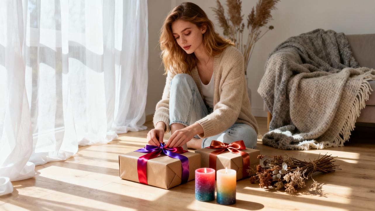
From a gifting point of view, this means a vivid red bow on a simple kraft box does very different emotional work than a soft sage-green ribbon on crisp white paper. One says “burst of excitement,” the other says “quiet, thoughtful calm.”

Warm, Cool, and Neutral: Setting the Temperature of a Gift
Design psychologists often talk about color temperature. This is a helpful way to think about emotional tone when you choose colors for a handmade piece.
Warm colors, primarily reds, oranges, and yellows, feel close and active. They can make a small card feel more intimate or a tiny pendant feel full of life. Insights summarized by Cover Styl and Platt College suggest that warm colors are particularly effective when you want to spark conversation, action, or appetite. In gifts, that might mean a bright orange thread in a recipe tea towel or a sunflower-yellow accent in a kitchen print for a friend who loves hosting brunch.
Cool colors, such as blues, greens, and many purples, feel more distant and calm. Research cited by The Decision Lab and The Interior Design Institute connects soft blues and greens with stress reduction and relaxation. These are ideal for gifts meant to soothe: a mint-green baby blanket, a watercolor seascape, or a lavender-toned journal for nightly reflections.
Neutrals hold everything together. Cream, beige, taupe, soft gray, and chocolate brown allow colored details to breathe. Studies on spatial color efficacy in retail interiors, reported in academic outlets like the National Library of Medicine, show that darker, neutral backgrounds can make a space feel more luxurious and comfortable when used thoughtfully. In gifting, pairing a rich charcoal box with a gold or rose-pink ribbon can instantly create a sense of understated luxury.

How Color Combinations Shape Emotion
Individual colors are only half the story. The way they combine often determines whether a gift feels harmonious, playful, dramatic, or simply “off.” Interaction Design Foundation, Nielsen Norman Group, and printing and poster specialists like Chilliprinting all emphasize the importance of classic color relationships that come from the color wheel.
Complementary Combinations: Dynamic and Attention-Grabbing
Complementary colors sit opposite each other on the color wheel: think blue and orange, red and green, purple and yellow. Cover Styl notes that these pairs have high contrast and create a sense of dynamism and visual interest. In signage and retail displays, they are often used to draw the eye to focal points.
In handmade gifting, complementary schemes can be wonderful when you want vibrancy and playfulness. A turquoise and coral bracelet, a blue-and-orange nursery print, or a red-and-green holiday ornament all feel lively and bold.
The advantage is emotional punch. These combinations are memorable and energetic. The drawback is that they can become visually noisy if both sides are equally bright and intense. Design educators and poster experts such as Chilliprinting recommend letting one color dominate and using its complement more sparingly, often in a ratio similar to seven parts main color to three parts accent. For a gift, that might look like a mostly teal scarf with tiny copper-orange embroidery, rather than equal stripes of teal and orange fighting for attention.
Analogous and Monochromatic Combinations: Gentle and Harmonious
Analogous colors sit next to each other on the wheel, like blue, blue-green, and green, or red, red-orange, and orange. They naturally appear in landscapes and skies, which is one reason people tend to find them pleasing and serene. Cover Styl notes that these schemes feel balanced and restful, particularly when colors share similar softness.
Monochromatic schemes use tints, shades, and tones of a single hue. Interaction Design Foundation points out that monochromatic palettes are simple, low-distraction, and ideal when you want unity more than contrast.
For sentimental gifts, analogous and monochromatic palettes are ideal for themes of peace, nostalgia, or quiet love. Imagine a memory box painted in layers of soft sage, olive, and eucalyptus green, or a wedding vow print that moves from blush to dusty rose to deep wine. The pro is cohesion and emotional subtlety; the con is that if everything is too similar, important details (like names or dates) may not stand out enough.
Triadic and Richer Palettes: Playful yet Balanced
Triadic schemes use three colors evenly spaced on the wheel. They offer strong contrast but, when handled gently, still feel balanced. Dribbble’s color and emotion guides, along with Nielsen Norman Group’s work, recommend using such richer palettes carefully and often in a 60–30–10 proportion: about sixty percent of a dominant color, thirty percent of a secondary color, and ten percent of an accent.
For example, a personalized children’s storybook could use a soft sky blue for most pages, a sunny yellow for illustrations and outfits, and small pops of coral red for key details. The triadic structure keeps things lively and childlike without becoming chaotic, especially when the shades are slightly softened.
The benefit of triadic combinations is that they can express multifaceted emotions: joy plus calm plus curiosity, for instance. The challenge is discipline. If all three colors are very bright and used in equal amounts, the result can be visually overwhelming.

What Research Says About Children’s Color Emotions
If you create gifts for babies and children, it is especially helpful to look at child-focused research. A fascinating study in BMC Psychology, published on SpringerLink, analyzed colors extracted from traditional Turkmen carpet ornaments and then tested them with parents of preschool children in China.
The researchers first distilled hundreds of shades down to 140 representative colors suitable for children’s products. They then asked 104 parents to evaluate 124 colors across six main hue groups. Results showed that warm colors were clear favorites. For boys, red, orange, and green ranked highest; for girls, yellow, red, and orange were most loved. Blue and purple were the least popular colors overall among these preschoolers.
When parents and children rated emotional responses, red produced the most positive feelings, followed by orange and yellow. Blue was often perceived as neutral rather than joyful. The researchers also tested specific adjectives. They found strong links such as yellow with excitement and happiness, red with amusement and a sense of danger, purple and green with comfort and curiosity, and blue with safety.
In a second survey with 48 parents, the team assembled and tested three-color combinations using an established Japanese color system by Kobayashi that maps color schemes to emotional adjectives. They found that soft, pale color combinations were particularly attractive. Palettes like very pale pink with green, yellow, and blue, or light gray-green with orange, green, and blue, received some of the highest preference scores. Deep red with green and blue, and vivid red with blue, also performed well, suggesting that when warm hues are grounded by cooler partners, they can feel both exciting and balanced.
For us as makers and givers, this research offers practical guidance. When designing a personalized toy, a growth chart, or a nursery print for preschoolers, warm-centered palettes anchored by touches of green or blue may resonate more than predominantly cold schemes. Pale, gentle versions of these colors can keep the overall feeling soft and nurturing, while small hits of more vivid red or orange inject delight.
At the same time, the authors emphasize that many colors, such as green and purple, often produced no strong emotional impact on their own and needed context. That is precisely where thoughtful combinations and meaningful motifs make the difference in a keepsake gift.

Brightness, Saturation, and Emotional Intensity
The Decision Lab’s synthesis of psychological research, including the classic pleasure–arousal–dominance model, underscores that color is not just about hue. Two other properties matter greatly: brightness and saturation.
Brightness describes how light or dark a color is. Higher brightness tends to increase reported pleasure but can decrease arousal and a sense of dominance. For example, a light, airy green may feel gentle and pleasant but not particularly powerful.
Saturation describes how intense or vivid a color is. Higher saturation tends to increase pleasure, arousal, and a sense of control. A highly saturated cobalt blue feels bold and assertive compared with a washed-out denim blue.
For gifts, this means you can fine-tune emotional intensity without changing the hue family. If you want a romantic but calming anniversary print, you might choose dusty rose and muted plum rather than neon magenta. If you are creating a motivational art piece for a home office, more saturated oranges and deep blues can energize and focus the recipient, especially when paired with calm neutrals.
The Decision Lab also notes that colors mimicking natural environments, such as soft blues and greens, are associated with stress reduction and visual comfort. So, a highly saturated red may be perfect for a small, motivational message on a bookmark, but a whole wall hanging in that same red might feel overwhelming. Scale and surface area matter: intense colors are often best reserved for smaller accents in a composition.

Designing Color Stories for Different Sentimental Occasions
In the studio, I often start with the emotion of the moment before I ever open a paint box or fabric drawer. Here are some emotionally grounded approaches, grounded in the research above, that you can adapt for your own handcrafted and personalized pieces.
Love and Anniversaries
Love is rarely just one emotion. It is warmth, safety, shared history, and sometimes a bit of spark or mischief. Warm colors like red, pink, and gold are natural here, but their combinations and intensities matter.
For a tender, long-term love, soft analogous palettes can feel deeply romantic without cliché. Think blush, dusty rose, and warm beige with a touch of muted gold. These colors echo the comforting side of red and yellow—warmth, happiness, and stability—without the urgency of bright scarlet. Academic work on spatial color efficacy suggests that darker, richer tones used as background can feel more luxurious; a deep plum mat board around a pale-pink watercolor of a couple’s vows can quietly elevate the piece.
For a more playful love, triadic schemes with one strong accent can work beautifully. A simple black-and-white illustration with a single vivid red heart and small touches of golden yellow captures passion and optimism while remaining visually clean.
Welcoming a New Baby or Celebrating Childhood
Here, the BMC Psychology study on children’s preferences is particularly helpful. Warm, bright colors like red, orange, and yellow elicited positive emotions and were often favorites, especially when balanced with friendly greens and safe-feeling blues.
For a nursery gift, you might create a palette of very pale pink or peach, mint green, butter yellow, and soft sky blue, echoing the most attractive combinations reported in that research. These hues feel gentle yet joyful and can be expressed in mobiles, name plaques, or fabric blocks. Tiny pops of more saturated red or orange can mark important details, like a birth date or a favorite animal, bringing in the excitement and amusement children associate with those colors.
If the family prefers a more minimalist aesthetic, a largely neutral base—warm ivory, light gray, soft tan—can be warmed up with small, warm accents: a coral stitch here, a mustard felt star there. This matches recommendations from Cover Styl and interior design educators to keep restful spaces cool or neutral with minimal bold accents.
Comfort, Sympathy, and Healing
For sympathy pieces or gifts meant to comfort someone during illness or grief, color needs to feel trustworthy and gentle. The Decision Lab notes that muted tones and pastels, such as beige and soft pinks, foster comfort and security. Health environments often lean on quiet blues and greens for their calming and healing connotations.
A sympathy card or memorial keepsake might work well in a palette of soft blue-gray, sage, and warm white, perhaps with a small accent of lavender. Blue offers safety and trust, green offers renewal, and neutrals provide space to breathe. Darker accents, like charcoal or deep forest green, can ground the piece and introduce the sense of seriousness and respect that black and deep tones often convey, as suggested by design institutes and signage psychology.
The key here is moderation. Highly saturated colors, especially reds and bright yellows, can feel jarring in this context. Using them only in tiny symbolic touches—a single red thread, a gold leaf detail—can be powerful without overwhelming.
Milestones and Achievements
Graduations, promotions, and big personal goals deserve a different energy: proud, confident, and forward-looking. Marketing and UX research shared by UXMatters reveals that high-contrast, vibrant colors are effective at drawing attention and prompting action. Brands often pair blue (trust and stability) with bright accents like yellow or orange (optimism and enthusiasm) to highlight key offers.
For a handcrafted milestone gift, such as a custom print of a diploma quote or a personalized leather journal, consider a foundation of deep navy, charcoal, or rich brown combined with metallic gold or copper. This echoes the luxury and seriousness associated with dark neutrals and metallics in branding studies and interior design. Then add one energetic accent, perhaps a small strip of vivid turquoise or a bright orange tassel, to signal momentum and creativity.

A Practical Way to Choose a Color Palette for Your Gift
Putting all of this into practice can feel overwhelming, but a simple sequence helps. In my studio, the process unfolds in a few deliberate steps.
First, define the emotional intention of the gift. Are you aiming for comfort, celebration, romance, encouragement, or playful joy? Try to choose one or two main feelings rather than a whole list.
Second, pick a base temperature. For comfort and calm, lean toward cool and neutral; for celebration and action, lean toward warm; for depth and elegance, lean on darker neutrals and one rich accent.
Third, choose a dominant color that embodies the primary emotion. If the gift is about trust and new beginnings, perhaps a gentle green. If it is about joyful celebration, maybe a soft but sunny yellow.
Fourth, support that color with one or two companions using a harmony model. For gentleness and unity, choose analogous hues. For energy, add a complement or a triadic partner as a smaller accent, respecting the idea that roughly sixty percent of the gift’s surface should reflect the dominant color, thirty percent a secondary, and ten percent an accent, as described by design practitioners on Dribbble and by Nielsen Norman Group.
Finally, adjust brightness and saturation to match the recipient and context. Older recipients or those in sensitive situations often appreciate more muted tones; children and highly celebratory events can handle brighter, more saturated accents.
Whenever possible, test your palette. Digital mockups, small painted swatches, or temporary adhesive materials, as Cover Styl suggests for interiors, allow you to preview how the colors actually feel together before committing your time and materials.

Common Color Pitfalls in Personalized Gifts
Even the most heartfelt gift can feel “not quite right” if the colors clash with the message or the recipient’s life. Experienced designers and psychologists highlight a few recurring hazards.
Using too many strong colors at equal strength is one of the most common issues. Cieden and Nielsen Norman Group both caution that crowded, high-saturation palettes create visual clutter and reduce clarity. In a gift, this can mean that the name, date, or special message gets visually lost. Limiting yourself to one dominant hue, one supporting hue, and one accent keeps the piece coherent.
Ignoring contrast is another challenge. Accessibility guidelines from UX and web-design communities stress the importance of clear contrast between text and background. On a physical gift, this means ensuring that script on a tag or engraved text on a painted surface is readable from a normal distance. Pale gold ink on a white background may be elegant but nearly invisible; deep navy on warm white is often both beautiful and legible.
Relying solely on general color rules without respecting culture and personality can also backfire. Articles from Platt College, Interaction Design Foundation, and others remind us that white, red, and yellow carry very different meanings across cultures. If your handmade piece is for someone with strong cultural or spiritual traditions, gently exploring what certain colors mean to them is an act of respect.
Finally, treating color as an afterthought instead of a central design decision often leads to compromises. UXMatters encourages iterative testing of color in digital products; in gifting, an equivalent is laying out your threads, paints, or papers and revisiting them over several days. Sometimes the palette that felt exciting at midnight looks chaotic in daylight. Giving yourself that breathing room lets your intuition catch up with the research.

FAQ: Color Choices for Sentimental, Handmade Gifts
How many colors should I use in one handcrafted gift?
There is no strict rule, but many design practitioners suggest that three main colors, plus neutrals, are enough for most pieces. You can still create richness by using lighter or darker tints of those colors. This approach echoes the 60–30–10 balance described in design research: one dominant color, one supporting color, and one small accent. More colors can work, but they require very careful control of brightness and saturation to avoid confusion.
Is it safe to follow generic “red means love, blue means calm” charts?
Those charts are useful starting points, and many research summaries, including those by Interaction Design Foundation and The Decision Lab, confirm broad tendencies. But they are not universal. Culture, age, and personal history all shape how someone feels about a color. Use the charts as gentle guidance, then filter them through what you know about the person and occasion. If your friend has always disliked pink, no amount of “pink equals romance” theory will make a pink journal feel right for them.
How do I choose colors for a gift when I do not know the recipient very well?
When in doubt, start with neutrals and softly saturated hues. Ivory, soft gray, warm taupe, and gentle blues or greens tend to feel safe and welcoming across many cultures, according to interior and color-psychology sources. Add small, meaningful accents based on the occasion rather than guessing at personal favorites. For a graduation, a thin stripe in the school color on a largely neutral piece feels thoughtful without overpowering; for a baby shower, pale warm tones with soft natural greens are usually well received.
Color is one of the most tender tools you have as a maker and gift-giver. It lets you say, “You are safe,” “You are celebrated,” or “I remember this with you” before a single word is read. When you combine insights from psychology and design research with your own lived experience and the stories you share with someone, you are not just choosing pretty shades. You are composing an emotional chord that will ring through their memory each time they look at your handmade piece.
References
- https://pmc.ncbi.nlm.nih.gov/articles/PMC7136482/
- https://platt.edu/blog/psychology-color-graphic-design/
- https://www.rmcad.edu/blog/the-psychology-of-color-in-graphic-design/
- https://insightspsychology.org/psychology-of-color-emotional-impact/
- https://www.interaction-design.org/literature/topics/color-theory?srsltid=AfmBOop_O2gYboK-_MFnXfpSWkyTPgQ4rm0q44umMTvaIRdK6TNl-bsY
- https://uxdesign.cc/the-power-of-colour-in-ux-1748c16491f3
- https://www.austinsignco.com/emotional-impact-of-colors-in-signage-design/
- https://bmcpsychology.biomedcentral.com/articles/10.1186/s40359-024-01644-6
- https://cadabra.studio/blog/color-psychology-in-design/
- https://www.chilliprinting.com/online-printing-blog/use-color-psychology-emotions-poster/?srsltid=AfmBOoqm96cu0EKXGBf-knQvU94Eo-FAtJY9xMMhyNJx2uHeHRN0dAVL
