How Deep Learning “Sees” Warm and Cool Tones: A Maker’s Guide to Color, Feeling, and AI
Color is one of the most intimate choices we make as creatives. The warm blush of a hand-painted card, the cool eucalyptus green on a candle label, the soft “greige” ribbon around a gift box—these decisions carry emotion long before anyone reads a single word. Today, many of those colors are being captured, corrected, classified, and even suggested by deep learning systems. If you sell handmade pieces online, photograph your work, or lean on AI tools to suggest palettes, you are already collaborating with these invisible color critics.
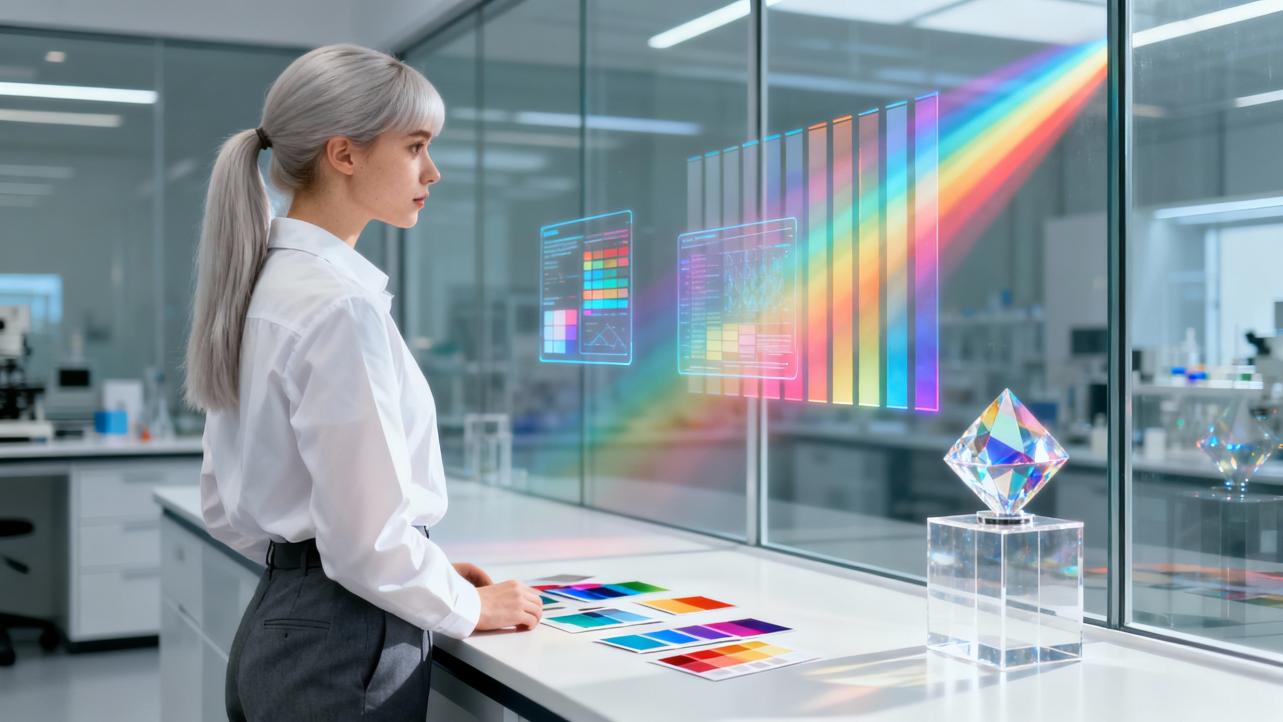
In this article, I want to sit at the crossroads between the studio and the server room and unpack how warm and cool tones show up in deep learning. We will anchor everything in what perception science and current research actually say, then translate it into practical, heart-centered advice you can use for your own art, photos, and personalized gifts.
Warm vs Cool Tones: The Emotional Color Wheel in Plain Language
Before we peek inside any neural network, we need the language of warm and cool that artists, decorators, and color analysts use every day.
Warm colors live on the red–orange–yellow side of the wheel. Interior designers and color consultants describe this family as including classic reds, oranges, and yellows, but also many neutrals: brown, tan, taupe, beige, cream, and a wide range of earthy tones. Articles for home decorators emphasize that these colors tend to make a space feel cozy, welcoming, and energetic, visually pulling walls and objects closer. In a product shot, that same warmth can make a mug of cocoa or a hand-knit scarf feel extra inviting.
Cool colors live on the green–blue–violet side of the wheel. They include sea-glass greens, sky and navy blues, blue-leaning teals, and purples, along with many charcoals and slate grays. Even whites and blacks can lean cool when their undertones are bluish or icy. Decor guides describe cool schemes as restful, spa-like, and spacious, making small rooms feel larger and calmer. In photos of jewelry or skincare, cool tones can suggest freshness, clarity, and a more minimalist elegance.
Color specialists break a single hue into several properties. Hue is the basic family, such as “red” or “blue.” Saturation is how vivid or muted a color feels, from pure pigment to grayed-out sophistication. Value is how light or dark it is. Chroma or colorfulness describes how far the color sits from a neutral gray. Mixing complements or adding gray reduces chroma and often creates complex, tasteful tones.
Undertones are especially important for anyone choosing paints, fabrics, or dyes. Watercolor mentors and personal color analysts alike remind beginners that every “neutral” hides a direction. A gray can lean blue and feel cool, or lean yellow and feel warm. A green can tilt toward yellow and feel sunnier, or toward blue and feel more serene. Community color educators emphasize that even a white card or a black logo can have a warm or cool undertone that changes the emotional temperature of the whole piece.
Designers also stress that temperature is relative. Put two greens side by side and one will suddenly look warmer, the other cooler. Grays are notorious; many homeowners only realize a gray wall is actually a cool blue-gray when they compare it to a true neutral. That is why color professionals recommend comparing samples against a known neutral gray in the real lighting where they will live, and observing them throughout the day. The light in your studio at noon will not treat a terracotta mug the same way as the late-afternoon glow in your living room, and your camera (and any AI behind it) has to wrestle with those shifts too.
Most educators in home and fashion color agree on one more point: the most harmonious spaces and outfits rarely use only warm or only cool colors. A balanced palette usually has a dominant temperature and a supporting accent. A mostly cool bedroom might gain life from a few warm brass touches; a largely warm tablescape might sing with a small scattering of cool eucalyptus leaves. This idea of balance will reappear when we talk about deep learning models that have been trained to understand color harmony in clothing.

How Human Vision Organizes Warm and Cool
Warm and cool are often presented as simple opposites, but research on color perception reveals a more nuanced picture.
Vision scientists often describe early color coding in the eye and brain in terms of cone-opponent axes. At the very first stages, our visual system compares signals from long-wavelength cones against medium-wavelength cones, and short-wavelength cones against a mixture of the other two. Later, perceptual descriptions tend to talk about red–green and blue–yellow axes. These established axes are not exactly the same as the familiar warm–cool language we use in everyday life.
A recent warm–cool perception study, which worked in a cone-opponent color space and a perceptually uniform space like CIELAB, asked observers to rate how warm or cool different hues felt. The researchers found that, across observers whose ratings varied systematically with hue, the boundary between warm and cool runs roughly from an orangish red on the warm side to a greenish blue on the cool side. That boundary sits between the traditional cardinal axes. Warm–cool is not just a relabeled red–green or blue–yellow; it is its own diagonal feeling in color space.
Interestingly, when the researchers plotted those warm–cool ratings in CIELAB, they found a surprising relationship to saturation. The hues perceived as maximally warm or maximally cool tended to have relatively low saturation, while the boundaries between warm and cool categories aligned with the strongest chroma. This pattern suggests that our sense of warmth and coolness is shaped not only by hue but also by how intense the color is. The authors argue that adaptation to the color statistics of our environment, and multiple levels of processing across the visual system, likely contribute to this complex warm–cool experience.
Another vision-science experiment, reported in Journal of Vision under the title “Warm, cool, and the colors,” took a different approach. Instead of asking people directly which colors felt warm or cool, the authors analyzed patterns in differential judgments around the hue circle using Fourier methods. When they averaged across participants, the warm–cool structure looked like a clean wave that cycles once around the color circle, matching a fundamental component at frequency one. But when they examined individuals, only about half the participants showed a strong, low-noise warm–cool rhythm in their differential judgments. The rest produced noisy patterns where that fundamental component was hard to detect reliably. Categorical responses, where participants directly labeled segments as warm or cool, were much more consistent across the group.
Together, these studies offer two important lessons for anyone thinking about how AI should handle warm and cool tones. First, warm–cool is a meaningful, population-level structure, but it is not reducible to a single neat axis in the brain. Second, individual observers disagree, especially when you look at subtle continuous judgments rather than clear categorical labels. Any deep learning system that pretends there is only one “correct” warm–cool answer for every pixel is simplifying a far richer human experience.

From Color Wheel to Code: How Deep Learning Represents Color
Deep learning systems start from raw numbers. A typical digital image uses three channels, often red, green, and blue. With 8 bits per channel, that is 256 possible values for each, yielding about 16.7 million distinct color combinations per pixel. An article on intelligent color analysis notes that modern images and videos commonly contain around 20 million or more colors, which puts immense pressure on any system trying to extract meaning.
Traditional color analysis tools relied heavily on rules and manually designed features. An engineer might write thresholds such as “if red is high and green is low, classify as ‘red’,” or define fixed formulas to compute indices from RGB values. These approaches struggle in real-world conditions because they cannot easily capture the diversity of lighting, textures, and subtle color variations. They also do not scale well to the giant, messy datasets we see today.
Deep learning and modern machine learning bring a different approach. Instead of hand-coded thresholds, they learn patterns from data. But even then, how color is represented matters. Practical color-detection work often moves from raw RGB to other spaces such as HSV or HSL, which separate hue from saturation and brightness, or to perceptually oriented spaces such as CIELAB. In these spaces, distances between colors better reflect human judgments: a modest shift in L*, a*, or b* maps roughly to a just noticeable difference in appearance.
For simple detection tasks, machine learning practitioners sometimes apply basic per-channel thresholding or clustering. Pixels are assigned to color classes based on whether they fall within certain HSV ranges or near cluster centers learned by algorithms like k-means. For more sophisticated tasks, such as style recognition or defect detection, convolutional neural networks learn their own complex filters that behave like adaptive color and edge detectors.
The choice of color space can significantly affect how easily a model picks up warm/cool differences. In one study on a low-cost biochemical color sensor built from a Raspberry Pi and a TCS3200 RGB chip, researchers converted raw sensor data into multiple color spaces, including HSL, HSV, CMYK, and CIELAB. They then trained an ensemble of regression models—random forest, gradient boosting, support vector regression, and a multilayer perceptron—to estimate protein concentration from color-changing assays. Their emphasis on HSL and CIELAB was intentional, because these spaces align better with human intuitions about hue and saturation, enabling the models to recognize subtle shifts that our eyes also care about. While the application was scientific rather than artistic, the principle is the same: if you want an AI to respect the emotional and perceptual differences between a slightly warmer or cooler tone, feeding it a color space that mirrors human perception is a powerful start.
Teaching Networks to Ignore Light: Deep Learning and Color Constancy
One of the biggest challenges in both photography and deep learning is color constancy: the ability to see a handmade card as the same soft blush under warm evening lamplight and under cool window light.
A comprehensive vision science and deep learning study tackled this explicitly by generating tens of thousands of spectrally accurate images. They used a physically based renderer to create scenes with more than 2,000 different 3D objects and surfaces colored with 1,600 Munsell chips. Each scene was illuminated by one of 279 natural light spectra, including a family of standard daylight illuminants and measured forest lights. Instead of RGB, the images were encoded using human cone sensitivities, yielding three “LMS” channels corresponding more directly to how our eyes respond.
Deep neural networks were then trained to classify the surface color of a foreground object—essentially, to recognize the Munsell chip—across this wide range of illuminations. In tests with new, unseen illuminations that were carefully spaced in a perceptual color space, the models achieved very high accuracy, even exceeding human constancy in some conditions. However, their performance declined markedly when the researchers systematically removed cues from the scene. When surrounding surfaces or other contextual information were stripped away, color constancy degraded, echoing psychophysical findings that humans also rely on more than local pixel statistics to stay color constant.
An especially interesting outcome for our warm–cool story is how different architectures represented color internally. Classic convolutional networks and more complex residual networks all performed well behaviorally. But the simplest custom model, dubbed DeepCC, organized its internal representation along three axes that closely resembled human perceptual dimensions: roughly lightness, a red–green dimension, and a blue–yellow dimension. More complex models achieved similar accuracy with less obviously human-like internal codes. This suggests that, when carefully designed, a deep network can learn a color space that aligns with our own intuitions, including the diagonal warm–cool feelings that cut across those axes.
For creatives, this matters whenever you trust an AI tool to “fix” color in your product photography. Systems trained with rich, varied illuminations and human-like color encodings are better poised to keep your warm craft-paper envelopes feeling warm even when the light changes. Systems trained in narrower conditions or on raw RGB alone may be more likely to swing your carefully chosen undertones toward a colder or muddier look.
Warm and Cool as Harmony: Clothing, Packaging, and Palette Suggestions
Beyond simply recognizing colors, some deep learning systems are explicitly trained to judge whether color combinations feel harmonious. Although these models do not usually label anything as “warm” or “cool,” the warm–cool balance is woven into how people rate harmony, so it inevitably shapes what the models learn.
A recent study in Fashion and Textiles built two families of color-harmony evaluators for clothing. In the rule-based path, the authors assembled 20 carefully crafted color features that included averages in RGB, CIEXYZ, and CIELCH, as well as area ratios of different garments. A deep neural network predicted eight classical harmony rules and a continuous aesthetic index, reaching macro accuracy around 0.98 and F1 scores around 0.96, with low regression errors. In the perception-based path, they ran psychophysical experiments to label 500 outfits as either harmonious or not, an imbalanced dataset where harmonious outfits far outnumbered disharmonious ones. After mitigating this imbalance with a combined oversampling and noise-editing method, a support vector machine using the same handcrafted features achieved about 0.99 on accuracy, precision, recall, and F1 with semi-supervised learning on more than 9,000 outfits.
The authors then trained a separate image-based deep model—a custom convolutional network—to evaluate harmony directly from clothing photos. This network reached about 0.953 accuracy and an area under the curve of roughly 0.95, outperforming transfer learning with VGG16 and ResNet101 in this specific harmony task. For practical deployment, they recommended the CNN because it worked directly on raw images, avoiding the need for manual region detection and feature extraction.
Their recommendation system went even further. Using a generative adversarial network with a variational autoencoder-like generator, they trained on grayscale clothing images paired with harmonious color schemes. The generator learned to predict the chromatic channels (a* and b*) from grayscale inputs, effectively colorizing outfits in ways that align with human harmony judgments while preserving garment texture. In other words, the model could take the “bones” of a design and paint in a likely appealing palette.
Warm and cool tensions are quietly embedded in these harmony labels. People may prefer certain warm tops with cooler bottoms, or favor a touch of cool to balance an otherwise warm ensemble. Because the harmony labels came from human judgments, these preferences seep into the dataset and shape the latent color space the model learns. For a maker experimenting with AI tools to suggest colorways for a collection of hand-dyed scarves or printed totes, this kind of model can become a color-savvy collaborator, as long as you remember that it encodes the average taste of many people, not your personal brand’s exact story.
Packaging design research shows similar moves. One paper on color-matching automation for packaging design describes a deep learning framework trained on packaging samples to help designers choose and verify colors that match product attributes and category norms. The authors note that the model’s generalization is limited by a relatively small sample size and by the fact that real packaging must consider multi-color schemes, textures, and other visual factors beyond flat color. Still, by learning from existing packaging and studies in color research and application, such systems can flag when a proposed box color strays too far from what shoppers expect for a given product type. Since other work has shown that package colors and design elements strongly influence online purchase decisions, having an AI double-check whether your candle tin leans too cold for a “cozy winter” message is not as far-fetched as it sounds.

When Warmth Is Literal: Thermal Cameras and Color-Based Temperature Sensing
So far we have talked about warm and cool in an emotional sense. Deep learning also engages with warmth in a literal thermal sense, and interestingly, the visual patterns and limitations echo the more poetic warm–cool world.
A recent arXiv paper on building envelope inspection introduced a label-free anomaly-detection method that predicts thermal images from standard color photos. The authors used a generative adversarial framework to learn a mapping from three-channel RGB images of building facades to single-channel thermal images obtained with passive infrared thermography. The model was trained as a one-class classifier on examples of normal, defect-free facades. After training, regions where the predicted temperatures and the measured ones diverged strongly were flagged as anomalies, such as thermal bridges and heat leaks.
Passive infrared thermography is a powerful tool for diagnosing building energy performance, from heat bridges and air leaks to structural defects and mold risks. But field measurements are sensitive to reflections, viewing angle, wind, sky temperature, and surface emissivity, making automated defect detection difficult. Most prior AI work relied on fully supervised methods that demanded pixel-level labeling and controlled conditions. In contrast, this one-class color-to-thermal approach fits into a broader “deep representation of normality” paradigm, where models learn to reconstruct or predict normal examples well and reveal anomalies as areas of high error.
Visually, these error maps highlight unexpectedly warm or cool patches on a building’s surface. A thermal bridge might appear as a bright streak where the building is losing heat. The model’s special skill is not that it knows what a “bad” warm patch looks like, but that it has learned what a normal pattern of warmth and coolness should be for a given facade.
A different line of work explores thermometry with luminescent materials. In one study, researchers used nanophosphors based on GdVO₄:Sm³⁺ to build a temperature sensor that combines color and time. They recorded streak-camera images with hundreds of spectral points and hundreds of time points over a temperature range from about 80°F up to roughly 660°F. Instead of relying only on simple intensity ratios between emission peaks, they trained a neural network on carefully selected wavelength bands and time windows, compressed into a few thousand features per sample. The network, with two hidden layers and a single temperature output, was trained with data augmentation that exploited the physics of the system, such as shifting the region of interest vertically to change noise patterns without altering spectral shape.
Dimensionality reduction methods like principal component analysis and t-SNE showed that spectra clustered meaningfully by temperature, confirming that the data carried usable information. By combining spectral profiles, lifetime decay, and deep learning, the system achieved more accurate temperature predictions than intensity ratios alone.
For our purposes as makers, the main message is this: whenever deep learning connects color to heat, it leans on subtle patterns of brightness, hue, and temporal behavior that our eyes often feel only as “warmer” or “cooler” glow. Even in highly technical contexts, the algorithms are still chasing gradients of warmth and coolness, just in a calibrated, quantitative way.

Where Warm and Cool Live Inside Real-World AI Systems
Across industries, deep learning systems are already making judgments based on warm and cool information that would feel familiar to a painter or decorator, even if the systems never use those words.
In manufacturing and inspection, deep learning classification tools like those described by industrial vision companies learn directly from labeled images to sort parts by visual attributes such as color, texture, material, or defect type. These tools are used to check assembly, control processes in real time, and improve quality. Traditional rule-based vision struggles with variable shape, position, and lighting; deep networks instead learn to focus on relevant regions while ignoring busy backgrounds and glare. In automotive manufacturing, for example, a classifier can count spark plugs on a tray and categorize them by subtle color differences while ignoring the tray’s own color. In electronics, texture-based models detect tiny hits, stains, or scratches on reflective metal surfaces, separating acceptable variability from true defects.
Image-based herbal authentication offers another example. A study in Agriculture examined two visually similar medicinal herbs, Zizyphus jujuba and Zizyphus mauritiana. The authors trained three deep architectures—a basic convolutional network, DenseNet, and InceptionV3—on grayscale, RGB, and a combined RGB-GE format that added grayscale and edge information to the three color channels. Every configuration surpassed 90 percent accuracy, and grayscale alone reached about 90.7 percent, confirming that shape and brightness can substitute for color in some discriminations. With RGB-GE, a simple basic network achieved about 98.4 percent accuracy, nearly matching the 98.55 percent of larger pretrained models while using far fewer parameters and roughly 80 percent less inference time. Explainable AI techniques like Grad-CAM showed that the model focused on surface smoothness differences consistent with expert manuals, lending trust to its decisions.
Closer to the studio, a variety of machine learning and deep learning applications are being built for tasks that echo what we do when styling a product photo or curating an Etsy storefront. Research on deep learning color recognition models highlights applications where cameras must measure and classify color reliably on production lines, while studies on automated packaging design discuss how AI can evaluate combinations of text, graphics, and color to maintain brand consistency. A graduate thesis topic on color classification using machine learning, even without detailed results in the notes, reflects a trend: mapping numerical color representations into meaningful classes is now a widely taught and researched task.
All of these systems depend, at some level, on ingredients we have already discussed: robust color spaces, attention to illumination and color constancy, and datasets where human judgments of what looks “right” or “off” shape the labels. Whether an AI is catching an overly cool patch in a thermal image or a slightly wrong shade of brand red on a carton, it is tracing boundaries in a high-dimensional space that echo the warm–cool contrasts we use intuitively in our handmade work.
Working With AI on Warm and Cool Tones in Your Creative Practice
For artisans and small brands, the question is not whether deep learning will touch your colors, but how you can collaborate with it without losing your own eye.
One practical step is to pay attention to color space and white balance in your workflow. When you photograph your products, cameras and editing software often make their own white-balance decisions, sometimes pushing a naturally warm room toward an overly cool neutral or vice versa. Photography educators emphasize that automatic white balance tends to do well in simple daylight but often misjudges indoor or mixed lighting. They recommend checking camera presets rather than relying blindly on automation, especially under warm tungsten or mixed sources. Shooting in RAW lets you adjust white balance later, but large corrections can slow your workflow and still leave mixed-light issues.
Deep learning-based color constancy models, like those trained on spectral renderings of Munsell chips, show that AI can be surprisingly good at recovering stable surface colors under varied illumination, particularly along natural daylight changes. But they also reveal how performance drops when contextual cues are stripped away. Translating that into a studio tip: avoid photographing your work against extremely plain, context-free backgrounds if you know automated tools will later adjust the color; give the system some surrounding surfaces to “read” the light.
A second step is to remember that harmony models reflect the averages of their training data. The clothing color harmony work achieved about 0.99 accuracy with handcrafted features and about 0.95 with a CNN, closely matching participants’ judgments. That is impressive, but those judgments came from a specific group in a particular cultural and fashion context. If an AI suggests that your warm terra-cotta and cool teal combination is “disharmonious,” it may simply be echoing mainstream tastes that do not align with your niche or your story. Use these tools as starting points rather than final judges, much like a color-loving friend whose taste you respect but sometimes defy.
Third, be mindful of dataset limitations. The packaging color-matching study explicitly notes that its model’s generalization is constrained by a relatively small sample size and by the fact that real-world packaging must account for multicolor schemes and textures. Herbal identification and other domain-specific systems are often trained under controlled imaging conditions that differ from your own environment. When you feed AI tools photos of hand-thrown mugs shot on rustic wooden tables in variable natural light, you are pushing them beyond their original comfort zone. Expect occasional surprises, especially in borderline warm/cool categories like greige, taupe, and sage.
Finally, consider calibration and small-scale experiments as part of your gifting practice. Just as the biochemical sensor study used controlled standards to relate color changes to concentration, you can create your own “color standards” for your brand. Photograph a set of reference items—your signature warm kraft box, your favorite cool green ribbon, a neutral gray card—under the lighting conditions you care about. Run those images through whatever AI-driven tools you use, from auto-enhance in a photo app to a palette-suggestion model. Note where the AI stays true and where it nudges warmth or coolness away from your intent. Over time, you will build a sense of how to nudge the system back, or when to override it.
A Quick Comparison: Human vs Deep Learning Views of Warm/Cool
Aspect |
Human eye and heart |
Deep learning system |
Basic warm/cool sense |
Warm feels like fire, sunlight, closeness; cool feels like water, sky, distance |
Sees hues and brightness as numbers in a color space; warm/cool emerges from learned axes |
Handling of lighting changes |
Uses color constancy; often keeps perceived colors stable despite changing light |
Needs training on varied illuminations; performance drops when contextual cues are removed |
Harmony judgments |
Balances warm and cool for mood and personality; influenced by culture and taste |
Learns harmony from labeled outfits or designs; encodes average preferences in the data |
Anomaly detection |
Spots “too hot” or “too cold” spots by experience and context |
Learns normal thermal or color patterns; flags large prediction errors as anomalies |
Neutral grays and undertones |
Sensitive to subtle undertones once trained to see them |
Sensitive if given perceptual color spaces or sufficient data; can misread rare undertones |
FAQ
Can a deep learning model really tell whether a color is warm or cool the way I do? Not in the same felt sense. Research on warm–cool perception shows that people’s feelings of warmth and coolness arise from interactions across multiple visual mechanisms, and observers do not always agree. Deep learning models learn to organize colors along numerical dimensions tied to their task—such as harmony, classification, or constancy. If those tasks and training data reflect human judgments, a model’s internal axes often end up correlating with warm–cool distinctions, but they remain approximations.
Why do my product photos sometimes look too cool or too warm after AI “fixes” them? Color constancy studies with deep networks show that performance is highest when models see rich context and illuminations similar to their training conditions, especially along natural daylight variations. When context is sparse, light is unusual, or surfaces are highly reflective, models can overcorrect, just as automatic white balance does under tricky indoor lighting. Including neutral references, avoiding extreme glare, and testing under your typical lighting all help AI-driven adjustments stay closer to your intent.
Is it better to feed AI my images in RGB, HSL, or CIELAB? For deep networks that learn from raw pixels, RGB is often sufficient, especially if the model has enough data to discover its own color filters. For smaller machine learning models or sensor-based systems, studies on intelligent color analysis and biochemical color sensing suggest that human-oriented spaces like HSL, HSV, or CIELAB can make warm/cool and subtle hue differences easier to learn. When in doubt, start with the space your tool recommends, then experiment with a small labeled set of your own images to see which representation best preserves the warmth and coolness you care about.
At the heart of both handcrafted gifts and deep learning is the same quiet magic: patterns that carry feeling. When you choose a warm blush envelope for a love note or a cool misty blue for a sympathy card, you are drawing on centuries of lived color wisdom. When a neural network corrects your lighting or suggests a colorway, it is drawing on patterns distilled from thousands of images and judgments. The most beautiful results arrive when you let those two ways of seeing meet—your human sense of warmth and coolness guiding the algorithm, and the algorithm quietly supporting your next artful, heartfelt choice.
References
- https://pmc.ncbi.nlm.nih.gov/articles/PMC12025320/
- https://scholars.csus.edu/esploro/outputs/graduate/Color-classification-using-machine-learning/99257831175001671
- https://jov.arvojournals.org/article.aspx?articleid=2800403
- https://arxiv.org/html/2402.02963
- https://ieeexplore.ieee.org/document/11146104/
- https://pubs.rsc.org/en/content/articlehtml/2025/ra/d4ra07510b
- https://www.researchgate.net/publication/336701050_Color_Temperature_Tuning_Allowing_Accurate_Post-Capture_White-Balance_Editing
- https://www.thespruce.com/understanding-warm-and-cool-colors-1976480
- https://aseasonforhome.com/warm-colors-vs-cool-colors-what-is-the-difference/
- https://www.createdcolorful.com/blog/warmvscoolcolors
