Techniques for Maintaining Aesthetic in Black and White Patterns
Black and white patterns are the quiet poets of the gifting world. When you strip away color, you are left with line, light, texture, and emotion. As someone who spends long evenings proofing letterpress prints, testing ceramic glazes, and arranging monochrome gift sets for clients, I’ve learned that keeping a black and white pattern beautiful over time is less about “no color” and more about careful, ongoing choices.
In this guide, we will explore how to design, photograph, print, and care for black and white patterns so they feel timeless rather than flat, and soulful rather than stark. Along the way, I will weave in insights from photographers, color scientists, and design researchers, translating their work into practical steps for makers and gift givers.
Monochrome vs Black and White: What Are We Really Working With?
In photography and design, monochrome simply means “one hue with variations of lightness and saturation.” A monochrome piece could be all blues, all sepias, or all greens. Black and white, on the other hand, uses only blacks, whites, and grays and is technically achromatic.
Writers on 500px emphasize that all black and white images are monochrome, but not all monochrome images are black and white. For handmade gifts, this distinction matters because many so‑called “black and white” pieces actually lean warm (creamy papers, charcoal inks) or cool (bright white papers, bluish blacks). These subtle temperature shifts are part of your aesthetic toolkit.
Design platforms such as Linearity describe monochromatic palettes as ranges of tints, shades, and tones built from a single base hue. That same thinking applies to black and white. You are not choosing just two colors; you are choosing how many distinct grays you want, how deep your blacks will go, and how bright your whites can safely be without glare.
A review on Wiley Online Library notes that palettes with around five or six colors often balance simplicity and richness in design. Even though that research focuses on color palettes extracted from images, it is a useful mental model for black and white patterns as well. When you print a gift wrap, carve a stamp, or design a digital pattern, you rarely need a dozen micro‑steps of gray; a small family of well‑spaced tones is easier on the eye and more consistent across different materials.

What Makes Black and White Patterns Feel Aesthetic?
Photographer Ming Thein writes that in monochrome, mood is driven primarily by the quality of light and tonal structure rather than color. Translated to patterns, that means your aesthetic depends on four things: structure, contrast, negative space, and texture.
When I lay out a new black and white stationery design, I start by squinting at the sketch or the screen until I can no longer see details, only patches of dark and light. If the underlying pattern rhythm still feels balanced and interesting, it will usually translate well to ink, thread, or glaze.
Writers on 500px and Linearity highlight a similar idea: monochrome schemes are unforgiving when the underlying composition is weak. Without color to add interest, a pattern whose shapes are muddled or whose spacing is arbitrary will often feel muddy or busy once printed.
Aesthetic black and white patterns typically share these qualities, even across very different mediums like textiles, ceramics, or prints.
They have a clear structure. Motifs repeat with intention. Lines lead your eye somewhere, rather than bouncing it around without rest.
They use contrast thoughtfully. Some areas are allowed to be truly dark; others breathe with lightness. This creates a sense of hierarchy that tells your recipient where to look first.
They respect negative space. As Ming Thein notes, what you choose not to show carries its own emotional weight. Empty white around a pattern can feel calm and safe; dense black areas can feel mysterious or intense.
They embrace texture. 500px’s guidance on monochrome photography underlines texture as a main source of interest when color contrast is not available. In handmade gifts, this can be paper tooth, letterpress impression, woven fibers, or brushstroke grain.

High‑Key vs Low‑Key: Controlling Mood in Black and White
In both photography and design, high‑key pieces are dominated by lighter tones, while low‑key work leans heavily into dark values. 500px articles on monochromatic schemes and Ming Thein’s writing on light and mood give us a simple but powerful way to think about this for patterns.
High‑key black and white patterns feel airy, gentle, and often nostalgic. Imagine pale gray florals on soft white stationery for a wedding, or a baby blanket with faint, sketch‑like animals. Here, the blacks rarely go all the way to ink‑jet black; they hover as mid‑gray lines on bright backgrounds.
Low‑key patterns feel dramatic, moody, and bold. Think of a jet‑black notebook cover with thin white line art, or a gift box wrapped in near‑black paper with a subtle, glossy pattern emerging only when it catches the light. This approach is gorgeous for evening gifts, anniversaries, or anything you want to feel luxurious and a little secretive.
You can think of them side by side like this:
Tonal style |
Visual feel |
Gift moments that suit it |
High‑key (mostly light tones) |
Soft, calm, open, nostalgic |
Baby showers, weddings, sympathy gifts, handwritten letters |
Mid‑tone balanced |
Versatile, everyday, approachable |
Birthdays, thank‑you gifts, office gifting, journals |
Low‑key (mostly dark tones) |
Dramatic, intimate, luxurious |
Anniversaries, romantic gifts, evening events, limited editions |
The choice is not purely aesthetic; it is emotional. Research on cultural and creative products described in an article from a medical and design journal (PMC) shows that when designers align color schemes with emotional word scales, users feel more connected to the products. You can borrow that approach in black and white by pairing tonal style and pattern density with words like calm, bold, playful, or solemn, then designing toward those words.

Designing Black and White Patterns for Handmade Gifts
Start with Strong Shapes and Rhythm
Articles on 500px and Linearity stress that monochrome imagery works best when the scene already has strong shapes and a clear range of light and dark. For pattern design, that translates directly into the way you draw your motifs and lay them out.
If you are block‑printing tea towels, carve motifs with clear silhouettes and avoid overly fussy interior details that will fill in with ink. If you are drawing a repeating pattern for wrapping paper, test it very small and very large on your screen. The pattern should read clearly as a whole from a few feet away and reveal pleasant details up close, not sudden, jarring shapes that you only notice at the last second.
In my studio, whenever a black and white pattern looks “off,” the culprit is usually inconsistent spacing. Slightly tightening or loosening the gaps between elements until the whites feel evenly distributed often makes more difference than adjusting the black ink itself.
Manage Contrast and Negative Space
Ming Thein describes how smooth tonal gradients feel peaceful, while harsh jumps in brightness feel crunchy and intense. This is just as true for patterns as for photographs.
If you pack a page with dense black lines and tiny white gaps, the piece can feel noisy or anxious, which might be exactly what you want for a rock‑and‑roll gig poster, but not for a sympathy card. On the other hand, if you rely on only mid‑gray lines and leave huge areas empty, your pattern may feel washed out or unfinished.
For everyday gifts, I often aim for one area of strong contrast that anchors the eye and more gently graded areas around it. On a hand‑printed notebook, this might be a bold, dark spine pattern with softer lines drifting across the cover. On a ceramic mug, perhaps a crisp black rim or handle balances a looser gray pattern on the body.
Negative space is not wasted space. As Thein notes, what remains undefined invites the viewer’s imagination. In sentimental gifting, that open space gives your recipient room to project their own memories onto your piece.
Choose Pattern Scale to Match Use
Research on palette sizes suggests that limits support clarity. The same applies to how finely you subdivide your pattern.
A scarf viewed from several feet away needs larger shapes and bolder contrast so the design does not dissolve into static. A letterpress ex libris stamp on the inside of a book, seen at reading distance, can indulge in finer line work.
When in doubt, print or sew a quick prototype and look at it from across the room. If it loses its essence, either enlarge the motifs or increase contrast in key areas.
Working With Light and Texture: From Studio to Screen
Direction of Light and Shadows
Ming Thein emphasizes that directional light creates shadows, and shadows create the illusion of depth. For black and white patterns, this is crucial in two situations: when you photograph your gifts and when your pattern deliberately uses shadows as a design element.
If you are photographing a hand‑carved block or a quilted piece for your online shop, side light will skim across the surface and reveal texture, making the pattern feel tactile even on a screen. Backlight behind translucent paper can turn cut‑out patterns into glowing lace. Flat, front‑on light tends to erase texture and make black and white pieces look flatter than they truly are.
The same 500px guides that talk about monochrome photography suggest making deliberate use of natural light windows, golden hour, or even moody overcast skies to craft the tonal mood you want. You do not need fancy lights to do this; you only need to notice how light flows across your pattern and to rotate or tilt your piece until the shadows serve the story you want to tell.
Texture as a Stand‑In for Color
Without color, texture becomes one of your most powerful tools. 500px’s monochrome articles repeatedly point to texture as a way to add interest and depth when you cannot rely on vivid hues.
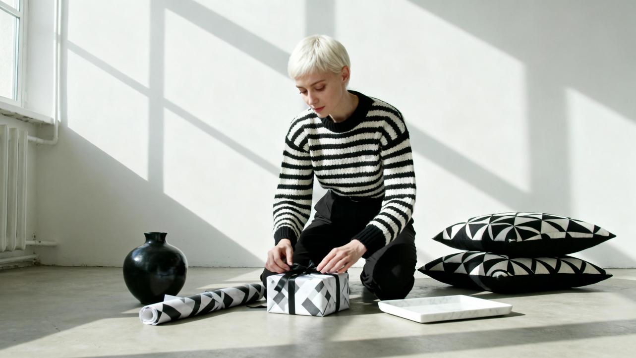
In handmade gifting, you can stack textures for emotional effect. A smooth, glossy black ink on thick cotton paper feels formal and polished. A chalky black ink on kraft paper feels earthy and relaxed. A dense, black embroidery thread on white linen feels cozy and traditional.
In my own practice, I often pair very simple line patterns with richly tactile materials. A plain grid of thin black lines suddenly feels special when debossed into soft paper or stitched onto a plush throw. The pattern itself stays minimal; the material does the emotive heavy lifting.

Photographing Black and White Patterns Beautifully
Even if your final gift is physical, your client probably meets it first through a photograph. That image is itself a black and white pattern of pixels, and its quality has a direct impact on how “premium” your work feels.
A discussion on Photo StackExchange explains that digital cameras with Bayer color filter arrays still need full color reconstruction, even if the final image is black and white. Skipping or simplifying that step can create strange artifacts and dull tonal mapping. In practice, this means that shooting in RAW and letting your editor handle a full conversion to black and white will usually give cleaner patterns than relying on a quick in‑camera monochrome setting that locks you into the camera’s default choices.
Quora discussions of white balance and color temperature in photography highlight something counter‑intuitive: white balance still matters even if you plan to convert to black and white. The camera’s white balance setting changes how different colors are rendered before they become grayscale. A warmer setting can lighten certain tones and darken others, subtly changing how your black and white pattern separates. If you want your series of product photographs to feel consistent, set a deliberate white balance rather than leaving it on auto.
Some modern phone cameras and dual‑camera systems use a dedicated monochrome sensor without a color filter array, as discussed in an MDPI article on color‑plus‑mono dual cameras. These sensors capture more detail with less noise in low light. For makers who often photograph work in dim studios or at evening markets, leaning on a phone with a good night or monochrome mode can preserve the fine edges of your patterns instead of smearing them into mush.
Digital Conversion: Keeping Patterns Lively When You Remove Color
Preserve Contrast Between Colors When Converting
A paper on image decolorization from a computer graphics journal proposes that the main job of a color‑to‑grayscale algorithm is to preserve contrast between different color regions. Even though your final piece is black and white, it should still be possible to distinguish a blue motif from a red one in the original image once both are gray.
Photographer and prepress specialist Dirk De Paepe describes a practical Photoshop workflow for doing exactly this. Instead of using a single, global black and white conversion, he advocates “sectional color processing”: selecting different areas of an image and applying separate black and white conversions and tonal adjustments to each.
Photoshop’s Black and White adjustment layer has separate sliders for red, yellow, green, cyan, blue, and magenta. By lightening or darkening specific color ranges before they become gray, you can make two similarly bright colors diverge in tone. In his example of two cars, lowering the red slider and raising the yellow slider made the cars, which originally collapsed into similar grays, separate visually so the main subject stands out.
When you translate that approach to gifts, it becomes a way to honor complex source material. If you are converting a family photo with colorful clothing into a black and white art print for a keepsake box, you can keep skin tones smooth while pushing a patterned dress darker to act as a visual frame. If you are turning a color painting into a monochrome notebook cover, you can protect delicate highlight details while intentionally deepening background colors so the main figure shines.
This mirrors the goal of the contrast‑preserving decolorization research: do whatever you must so that visually important differences in the original remain legible in the black and white result.
Build a Small, Intentional Set of Grays
Design articles from Octet Design and Linearity recommend using a limited set of tints, shades, and tones in monochromatic palettes. Typical digital palettes use around three to seven values of a hue to keep design decisions clear and avoid color chaos.
With black and white patterns, you can adopt a similar discipline. Decide up front how many gray levels you truly need. For example, you might choose paper white, a very light gray for background texture, a mid‑gray for secondary motifs, a dark gray for outlines, and a nearly black accent. Staying faithful to that tiny “grayscale family” across your products makes your collection feel intentional and cohesive.
Digital tools and color palette generators designed for monochromatic work, such as those mentioned by Octet Design Labs, allow you to explore value steps efficiently. You can sample your intended blacks and whites, check their contrast, and ensure that text remains readable over patterns on labels, tags, or cards.
Allow Tiny Accents Without Losing the Monochrome Feel
One 500px article notes that you do not always need a perfectly pure monochrome image to reap the benefits of a monochrome palette. Sometimes, one hue dominates a scene while a small second color appears briefly, and the result still feels cohesive.
For gifts, this opens up charming possibilities. A stack of black and white patterned boxes tied with a single ribbon in a muted color still reads as monochrome with a whisper of personality. A black and white notebook with only the recipient’s name stamped in metallic ink keeps the pattern aesthetic while giving the eye a single point of surprise.
The key is proportion. Linearity mentions a 60–30–10 rule for color distributions; in a black and white context, you can treat your neutrals as the sixty and thirty, and any accent as the ten or less. Let black, white, and gray do the heavy lifting, and use color like a signature rather than a flood.

Caring for Black and White Patterned Pieces Over Time
The Preservation Committee of the American Institute for Conservation has published detailed guidance on protecting traditional color photographic materials. Although their work focuses on color, the vulnerabilities they describe also touch many black and white prints and patterned surfaces.
Light can shift dyes and pigments over time. Even if your inks or glazes are labeled “archival,” constant exposure to strong light will gradually soften contrast. For framed black and white prints or patterned gift boxes meant to be displayed, suggest to recipients that they place them away from direct sunlight or strong artificial lighting. This is especially important for glossy, resin‑coated surfaces that can trap heat.
High humidity encourages mold and can affect gelatin or other binders, leading to discoloration or even emulsion loss on photographic prints. For handmade gifts, that translates to a general rule: store paper pieces in a dry, stable environment. Avoid attics, basements, or bathrooms where humidity swings wildly.
Highly glossy surfaces are more vulnerable to scratches and fingerprints, particularly in dye‑based systems like Ilfochrome described in conservation literature. If your black and white patterned gift has a mirror‑like finish, consider packaging it with a soft cloth or tissue and perhaps a small care card suggesting gentle handling.
These are small, quiet gestures, but they tell your recipient: this piece is meant to travel with you, not just flash across your feed and vanish.
Bringing It All Together: Examples from the Gift Studio
To make these ideas concrete, imagine three common black and white gift scenarios.
A custom black and white photo print for an anniversary. You begin with a color photograph. Drawing on decolorization research and Photoshop techniques, you convert to black and white while paying attention to how different clothing colors map into gray. You keep faces luminous, gently darken the background foliage, and protect highlight detail in jewelry or hands. You choose a mid‑tone paper with a soft texture so the print feels warm, then suggest to your client that they display it away from direct sunlight for longevity.
A hand‑printed black and white wrapping paper for holiday gifts. You design a repeating pattern with clear, bold shapes that read well from several feet away, leaving enough negative space for the eye to rest. You print in a rich but not fully opaque black, letting a hint of paper texture show through. Photographs of the paper are taken in side light so the impression of the ink is visible. Stored flat in a dry place and bundled with twine, the sheets feel like keepsakes even before they are used.
A limited‑edition black and white textile for a milestone birthday. You design subtle, low‑key patterns that only reveal themselves when the fabric moves. Drawing on 500px’s notes about texture and motion, you choose a weave that catches light and a pattern scale that keeps its identity whether worn or folded. Perhaps you add a single colored selvedge as a private accent. When you photograph it, you let the fabric drape and swirl so the repeated pattern becomes almost cinematic in black and white.
In each case, maintaining the aesthetic of the black and white pattern is not a one‑time step; it is a thread that runs from concept sketch to final care instructions.
Brief FAQ
Are pure black and pure white always the best choice?
Not necessarily. As design articles from Linearity point out for monochromatic work, using only extreme values can make designs feel harsh. For many gifts, deep charcoal and soft off‑white feel more human and forgiving while still reading as black and white.
How much contrast is too much for everyday gifts?
High contrast is striking but can feel aggressive if every square inch shouts. A balanced approach is to reserve the strongest contrast for focal areas, letting the rest of the pattern live in mid tones. This echoes Ming Thein’s observation that gentle tonal gradients feel calmer than constant, abrupt jumps.
Can I mix black and white patterns with colorful elements in one gift?
Yes, as long as black and white remain the visual anchor. You can pair a monochrome patterned notebook with a set of colored pens, or wrap a colorful gift in black and white paper. The monochrome pattern becomes a stage on which color plays, not a competing star.
Every black and white pattern you send out into the world is a small, wordless letter. By attending to structure, light, conversion, and care, you make sure that letter arrives exactly as you intended: clear, heartfelt, and beautiful for years to come.
References
- https://pmc.ncbi.nlm.nih.gov/articles/PMC9525916/
- https://scholarship.claremont.edu/context/cmc_theses/article/1881/viewcontent/Colormoo__An_Algorithmic_Approach_to_Generating_Color_Palettes.pdf
- https://arxiv.org/pdf/2108.07471
- https://usage.imagemagick.org/quantize/
- https://dl.acm.org/doi/10.1145/3580602
- https://vccimaging.org/Publications/Li2019DualCamera/Li2019DualCamera.pdf
- https://www.art-science.org/journal/v22n4/v22n4-15/artsci-v22n4-15.pdf
- https://library.imaging.org/admin/apis/public/api/ist/website/downloadArticle/cic/12/1/art00016
- https://www.researchgate.net/publication/387543209_From_Monochrome_to_Color_Efficient_Techniques_for_Realistic_Video_Colorization
- https://iso.500px.com/creating-impact-with-monochromatic-color-schemes/
