Techniques for Creating High Contrast Patterns for UV Printing
High contrast is the secret ingredient that turns a nice printed gift into a keepsake people cannot stop touching, tilting in the light, and photographing. When you pair the precision of UV printing with thoughtful contrast, you can make logos glow on matte boxes, patterns rise like embroidery on acrylic, and small sentimental details stand out on custom phone cases or ornaments.
In my studio, most of the “wow, how did you do that?” reactions come from contrast done well. The good news is that you do not need industrial volumes or huge budgets to achieve it. You need a basic understanding of UV printing, the right files, and a designer’s eye for light against dark, gloss against matte, and smooth against textured surfaces.
This guide walks through practical, real-world techniques for creating high contrast patterns specifically for UV printing, grounded in best practices shared by print providers like ABM, PakFactory, Mixam, Flexpress, Duplo, and several UV printer manufacturers.
Understanding UV Printing And Spot UV As Your Contrast Toolkit
Before diving into patterns, it helps to know what the technology is really doing on your gift pieces.
UV printing uses special inks that cure almost instantly when they are exposed to ultraviolet light. Instead of soaking into the material, the ink sits on the surface and hardens in place. As described by print specialists and UV printer manufacturers, that instant curing gives you very crisp details, vibrant color, and excellent durability on materials like acrylic, wood, metal, glass, plastics, and coated paper. It also means you can layer ink to build dimension.
Spot UV, also called spot gloss or spot varnish by companies like ABM, PakFactory, Mixam, and Flexpress, is a clear UV-cured coating applied only to selected areas of already printed artwork. It is technically a finishing technique, not a separate printing method. You print your base artwork first, then add the clear varnish on top where you want shine or raised texture. Under UV lamps, that clear layer hardens into a glossy, often tactile surface that can stand a few microns to several dozen microns above the base print depending on equipment, as Duplo documents for its DuSense systems.
The magic for high contrast is in how these pieces interact. When a glossy spot UV layer sits on top of a matte or soft-touch background, the contrast is dramatic. Mixam and PakFactory both emphasize that spot UV looks its best over matte laminates because the difference between flat and shiny is far easier to see and feel. Flexpress echoes the same guidance and even recommends using spot UV on heavier card paired with matte or soft-touch lamination for business cards, folders, and covers that feel truly premium.
For an artisanal gifting brand, that means you can:
Create a soft-touch box sleeve for handmade jewelry, then gloss only the client’s initials or a delicate motif.
Print a muted floral invitation for a wedding, then add raised gloss to just the petals or a monogram.
Design a minimalist acrylic plaque and use spot gloss like a “light” that appears only at the right angle.
Spot UV delivers some of the impact of embossing or foil stamping, but companies like ABM and Flexpress point out that it avoids the cost of metal dies and long setup, which is a huge advantage for small-batch and personalized work.

Why High Contrast Patterns Matter For Sentimental UV Gifts
When a customer chooses a personalized piece, they are not just buying decoration. They are trying to say something: a thank you, an “I remember,” an “I see you.” High contrast patterns support that emotional goal in several ways.
They guide the eye to what matters most, whether that is a name, date, or tiny symbol that has meaning only to the giver and receiver. Color and tonal contrast make those details readable at a glance, as color theory guides from DTF Print Co and others highlight.
They invite touch. Raised gloss, textured UV coatings, and layered inks create tactile contrast that encourages people to run their fingers over the surface. ColDesi and PakFactory both emphasize how spot gloss UV and textured coatings add a sensory dimension that boosts engagement and perceived value.
They photograph beautifully. High contrast patterns catch reflected light and shadow in a way that flat prints do not. This is especially important for UV-printed phone cases, acrylic photo blocks, and stickers that customers love to share online. UV printing guides for phone cases and stickers note how raised and glossy elements become natural focal points in photos.
For sentimental gifting, clarity is kindness. That means choosing contrast deliberately so the story your gift tells is never lost in muddy midtones or low-contrast backgrounds.

Color Contrast: Making Patterns Pop Without Losing Harmony
Color contrast is most people’s first instinct, and for good reason. In print, strong color contrast is essential for legibility and for focal elements to “pop.”
Work With The CMYK Reality
Most UV printers use CMYK inks rather than RGB light. Color theory articles geared toward printing, such as those from DTF Print Co and WER, stress that designs built in RGB can shift or dull when converted for print. If you want reliable, high contrast color patterns, design directly in CMYK.
Limit your palette to a small set of colors. DTF Print Co recommends one dominant color with one or two accent colors so your hierarchy stays clear. That makes it easier to create a strong foreground/background relationship instead of a confusing rainbow.
Use Light-Dark Contrast For Readability
For names, dates, heartfelt quotes, and any fine pattern details, the most reliable contrast is simple: dark on light or light on dark. This is a core recommendation across print color theory resources and UV phone case design guides.
On a light background, choose rich dark inks for text and line work. Some UV print guides suggest using a “rich black” mix rather than pure K to keep blacks deep and velvety.
On a dark or colored background, lean into light inks or use an opaque white underbase plus color. Many UV-printing guides, including those from MTUtech and CutPrintShip, highlight white ink as the key to bright color on non-white materials.
Imagine a custom UV-printed phone case. If the case itself is black, a pale hand-lettered quote will be more legible and emotionally resonant than mid-gray text that disappears from a few feet away.
Use Color Harmony For Emotion, Contrast For Focus
Color harmony still matters, especially for sentimental pieces. Resources from DTF Print Co, MTUtech, and Aikusu emphasize harmonies like complementary and analogous color schemes.
Complementary pairs, such as blue and orange or purple and yellow, give vivid contrast that works well for bolder, expressive gifts, like a UV-printed festival badge, a graduation plaque, or a playful kids’ phone case.
Analogous combinations, like several neighboring blues and greens, create a calmer, more cohesive feeling. These work beautifully for wedding gifts, sympathy pieces, and memorial ornaments where you want softer emotional tone. You can still achieve contrast within those families by shifting lightness and saturation, keeping the focal elements either darker and richer or lighter and clearer than the background.
Color psychology also plays a role. Warm reds, oranges, and yellows feel energetic and urgent. Cool blues and greens communicate calm, trust, and introspection. The color theory notes from DTF Print Co recommend aligning those choices with your brand and message.
Respect The Substrate’s Color And Texture
On paper or card stock, you can assume a more neutral, predictable base. On acrylic, wood, or colored phone cases, the surface itself becomes part of the color story. UV printing and UV DTF guides for acrylic and phone cases stress that you must factor in the base color and material when judging contrast.
If you are printing directly onto a clear acrylic photo block, for example, colors without a white underbase will look more transparent and less saturated. MTUtech and eufyMake note that applying a white layer behind your design dramatically increases apparent contrast and vibrancy. You can choose to leave some areas without white so the clear acrylic becomes a design element, but then be more conservative about color choices in those zones.
On wood, the grain introduces natural pattern and midtone variation. UV design tips from XDA and WER suggest embracing that by designing larger, bolder shapes and reserving white ink only for elements that truly need to stand out.
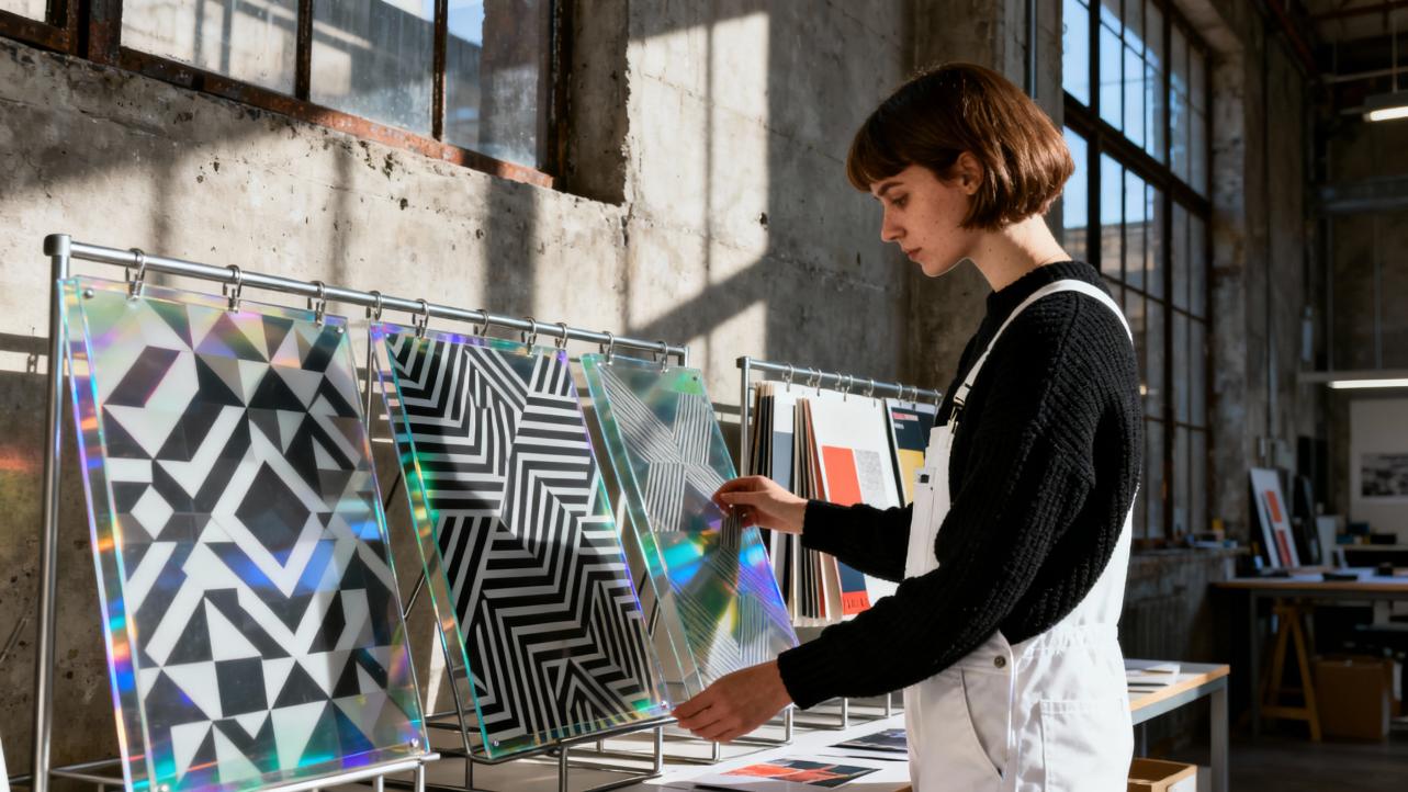
Gloss, Matte, And Texture: Contrast Beyond Color
High contrast is not just about color. In UV printing, especially for high-end gifts, the most memorable contrast often comes from finish and texture.
Gloss Versus Matte As A Visual Dimmer Switch
Spot gloss over matte laminate is a go-to combination in guidance from Mixam, PakFactory, ColDesi, and Flexpress. The matte acts like a dimmer, softening everything into a gentle, tactile base. The spot UV areas then act like little mirrors that catch and release light. That difference is easy for the eye to parse even when color contrast is low.
This technique is wonderful for understated sentimental pieces. You can print a nearly monochrome design on a soft-touch invitation or box, then gloss only a pattern of leaves, a constellation, or a date. Flat under normal light, it suddenly glows at an angle, like a whisper in print.
These sources also agree on a key design principle: restraint. Flexpress recommends keeping spot UV coverage relatively limited so it highlights key elements rather than blanketing the whole design. Overuse reduces contrast because everything becomes uniformly shiny.
Raised UV And Textured Coatings For Tactile Patterns
Modern digital UV equipment, from Duplo’s DuSense to various MTUtech systems, can build clear or colored inks into raised, textured surfaces. MTUtech’s guide to textured UV printing describes layered ink for raised logos, simulated embossing, and full 3D textures. Duplo notes coating thickness ranges that create subtle gloss or pronounced raised textures.
For high contrast patterns, this opens beautiful possibilities:
Raised dot patterns over a flat background for braille-inspired textures on inspirational plaques.
A lace-like gloss texture on a wedding invitation panel, mimicking fabric.
A faux-leather or frosted texture on a keepsake box, created with specialized UV coatings as described in spot UV technique guides.
These textures create contrast your fingertips can feel even with eyes closed. That sensory layer is powerful in sentimental gifting, where people tend to keep and handle items repeatedly.
Textured UV printing does have trade-offs. MTUtech notes that heavy texture requires more passes and time, and certain materials cannot support very thick ink layers. Flexpress cautions that very fine lines, thin stock, and areas near folds or edges are risky for raised spot UV because the coating can crack or peel. For delicate favors or thin paper goods, a lower-profile gloss may be safer than aggressive 3D texture.
Building High Contrast Patterns In Your Artwork Files
Once you understand how UV and coatings behave, the next step is translating that into clean, production-ready files. Several printers and print platforms offer similar guidance.
Start With High Resolution And Vector Shapes
For crisp patterns and typography, resources from CutPrintShip, MTUtech, WER, and others consistently recommend at least 300 DPI for raster images. Vector graphics are even better, since they scale cleanly to different phone cases, cards, or box sizes without losing sharpness.
When you design repeating patterns, geometric motifs, or fine details in vector format, you can easily adjust line weight and spacing. Design tips from XDA suggest slightly thickening very fine lines and small type, because UV ink can spread just a bit as it cures. That small adjustment preserves contrast, especially in delicate scripts and intricate patterns.
Separate Layers For Color, White, And UV Effects
The most reliable way to control contrast in UV printing is to think in layers. Mixam, Flexpress, ABM, Duplo, and multiple UV printer vendors recommend dedicated layers or even separate mask files for special effects.
A common structure looks like this in practice, even if you name your layers differently.
One base color artwork layer, built in CMYK.
One white ink layer, where shapes are filled to indicate where you want an opaque underbase on dark or clear materials.
One spot UV or varnish layer, using a solid, high-visibility spot color to mark glossy or raised areas.
Some printers, including Mixam and Flexpress, ask for the spot UV layer to be vector-only, with no gradients, blurs, or soft edges, to ensure precise, crisp application. PakFactory similarly stresses that mask files for spot UV should be solid black and white without fuzzy transitions.
For a handcrafted gifting brand, this layer discipline pays off when you revisit or remix a design. You can change colors seasonally, keep the same contrast-boosting white and gloss layers, and trust that your names, motifs, and stories still stand out as intended.
Use Bleeds, Safe Zones, And Registration-Friendly Shapes
Print guides from Mixam, Flexpress, CutPrintShip, and WER all emphasize proper bleeds and safe zones. Extend backgrounds and full-coverage patterns about one eighth of an inch beyond the trim line, and keep important text and focal graphics at least that far inside the cut line. Spot UV and raised textures should be pulled back slightly from edges and folds to reduce cracking.
Registration, the alignment between your color print and the spot UV or white layers, also affects perceived contrast. If a glossy highlight sits slightly off a printed shape, the visual tension can be distracting. Using “paste in place” for duplicate objects on your UV layer, as Mixam recommends, helps maintain perfect alignment. Some digital systems like Duplo’s DuSense also read registration marks and correct skew automatically, but clean file setup is still essential.
Choosing Materials That Amplify Contrast
The same high contrast artwork can look dramatically different depending on the substrate. The notes from MTUtech, eufyMake, EpicMarks, MTUtech’s phone case guides, and various spot UV resources point to a few reliable patterns.
Paper And Card For Stationery And Packaging
Matte-coated and soft-touch laminated boards are the darlings of spot UV because they maximize gloss contrast. PakFactory, Mixam, Flexpress, and ABM repeatedly recommend pairing spot UV with matte or soft-touch laminates for business cards, invitations, presentation folders, and packaging sleeves.
Thicker stocks also carry raised UV and texture more gracefully. Flexpress warns against very thin paper or uncoated stocks for heavy raised coatings, since they can warp, crack, or absorb the varnish unevenly. For artisanal boxes, belly bands, or high-end tags, choose a sturdy card that can handle both the emotional weight of the gift and the physical weight of the coatings.
Acrylic, Wood, And Hard Goods For Keepsakes
Acrylic is a favorite surface for UV printing because it is clear, durable, and bonds strongly with UV-curable inks. Guides from eufyMake describe how direct printing on acrylic with UV inks yields sharp, long-lasting images that resist scratches, water, and sunlight, especially when combined with a white underlayer and, when needed, textured printing for raised elements.
Wood and other rigid surfaces benefit from UV DTF as well as direct UV. EpicMarks explains that UV DTF printing lets you print a design on film, cure it, and then transfer it like a sticker to surfaces such as glass, acrylic, metal, wood, and plastic. For small gift studios without a full flatbed, this is a practical way to get high contrast logos or patterns onto diverse items like keychains, boxes, and decor pieces.
For outdoor signage gifts or garden markers, color management sources like the outdoor banner guide from YourABT note that prolonged UV exposure in high-sun environments accelerates fading. UV-curable and resin inks with proper lamination can reach multi-year outdoor lifespans, while eco-solvent options without lamination may be shorter. If the gift is meant to live outside in strong sunlight, plan for protective coatings or lamination to preserve your carefully crafted contrast.
Phone Cases And Everyday Carriers Of Sentiment
UV-printed phone case guides from MTUtech and Aikusu describe cases as both fashion and protection. High contrast patterns are especially important here because the design competes with constant motion and varied lighting.
These sources stress choosing compatible materials like polycarbonate, TPU, or silicone, using at least 300 DPI artwork, and treating cases as both art and ergonomic object. Avoid cluttering high-contrast patterns around camera cutouts or side buttons where they might interfere with usability. Instead, reserve your boldest contrast for the back panel, perhaps framing a name or illustration in a high contrast pattern while keeping edges simpler for grip.

Keeping Your Contrast Consistent: Color Management And Curing
Nothing is more disheartening than preparing a beautiful high contrast design and receiving prints that look dull, shifted, or uneven from batch to batch. Several manufacturers and ink suppliers share practical advice to avoid that.
Calibrate Displays, Printers, And Profiles
Color management articles for UV printing, such as those from Aikusu and WER, emphasize regular calibration of both monitors and printers. Calibrated displays help ensure that what you see while designing is a reliable reference. Device-specific ICC profiles tuned for your printer, ink set, and substrate help your RIP software translate colors accurately.
Guides suggest designing in CMYK, using standardized spot colors when brand-critical hues are involved, and embedding appropriate profiles when exporting files. Test prints on the actual material, especially for new substrates, are repeatedly recommended in resources from WER, CutPrintShip, MTUtech, and outdoor banner specialists.
Control Ink, Substrates, And Curing To Reduce Color Differences
Star Color’s discussion of color differences in UV ink printing notes that visible color variation can arise from ink batch differences, substrate characteristics, printing pressure, ink volume, and curing conditions. They recommend using the same brand and batch of ink for a job, mixing spot colors with precise tools, and being mindful of ink shelf life.
Proper substrate preparation also matters. MTUtech and Sublicool both stress cleaning surfaces thoroughly to remove dust, oils, and other contaminants so ink adheres evenly. For UV DTF and roll-to-roll systems, Sublicool recommends high resolutions, appropriate print speeds, and careful curing control to avoid under-curing, which causes poor adhesion and unstable colors, or over-curing, which can shift color and reduce quality.
Environmental stability is another subtle but important factor. MTUtech and Sublicool advise maintaining print environments around the upper sixties to mid-seventies in degrees Fahrenheit, with moderate relative humidity, to prevent ink viscosity changes and curing issues that can affect color and contrast.

Common High Contrast Mistakes And How To Avoid Them
When makers first discover spot UV and textured prints, it is easy to overdo it or overlook technical limitations. The most common issues show up in a few predictable ways.
Designs that looked energetic on screen print muddy or flat. Color theory and UV design tips frequently trace this back to weak light-dark contrast, overreliance on midtones, or ignoring how the substrate’s color affects perceived brightness. Returning to a simpler palette, boosting the difference in lightness between foreground and background, and adding a white underbase where needed usually solves this.
Gloss and raised areas feel misaligned or messy. Spot UV guides from Mixam, PakFactory, Flexpress, and Duplo all warn against using very fine lines or tiny type for raised coatings, especially near edges or folds. Simplify your gloss shapes, pull them away from edges, and ensure your UV mask uses solid vector shapes without gradients.
Textures crack or peel, especially on thin or uncoated paper. Here the advice from Flexpress and MTUtech is to avoid heavy raised UV on flimsy or unsuitable substrates, choose laminates that support adhesion, and keep coverage moderate.
Color varies from batch to batch. Star Color’s analysis points to inconsistent ink batches, changing print pressures, and varying curing as likely culprits. A simple log of successful settings and materials, combined with regular maintenance and calibration, can dramatically reduce these surprises.

A Practical Creative Flow For High Contrast UV Gifts
In practice, creating high contrast patterns for UV-printed gifts becomes a rhythm. For a typical project in my studio, the process unfolds like a conversation between emotion and technique.
I begin by clarifying the feeling the gift should carry. A soft, remembered love might lean toward analogous blues and greens with gentle gloss highlights, while a loud celebration might call for bold complementary colors and raised textures that you can feel across the room.
Next I sketch simple shapes and motifs that can handle strong contrast without feeling cluttered: a wreath of leaves, a repeating geometric border, a line-drawn portrait. As I refine, I constantly check light-dark relationships in grayscale, making sure the focal elements stand apart even without color.
Once the composition feels right, I build the file in vector where possible, set the color artwork in CMYK, and then create clear, intentional layers for white ink and UV effects. I mark only the most important areas for gloss or texture, often leaving a generous amount of matte or uncoated space to serve as quiet background.
Before running a full batch, I print a small set of test pieces on the actual material, under the same curing conditions I plan to use. I view them in both bright light and softer indoor light, and I run my fingers across every raised area. If any important name or symbol disappears at an angle, or if any edge feels fragile, I adjust line weights, gloss areas, or substrate choice accordingly.
That cycle of intent, design, layering, and testing keeps the technical side aligned with the emotional purpose of the gift.
FAQ: High Contrast UV Printing For Artful Gifts
How high should my resolution be for detailed high contrast patterns?
UV printing and phone case design guides from manufacturers like MTUtech and WER recommend preparing artwork at a minimum of three hundred dots per inch for crisp detail. Raster images at web resolution tend to look soft or pixelated when printed, especially in high contrast patterns where edges are very noticeable. When possible, build your patterns and typography as vector graphics so they remain sharp at any size.
Can I get strong contrast on dark or clear materials?
Yes, but you almost always need white ink as an underbase. UV printing resources from MTUtech, eufyMake, CutPrintShip, and others explain that colors printed directly on dark or transparent substrates appear dull and low contrast because light passes through or is absorbed by the base. A dedicated white ink layer beneath your design gives colors an opaque foundation, making them look brighter and more defined. You can intentionally leave some areas without white so the base material shows through for subtle effects, but keep your most important elements backed by white for maximum contrast.
How do I keep my high contrast colors consistent between batches?
Color management guidance from Aikusu, WER, Star Color, and outdoor printing experts all point to a combination of calibrated equipment, consistent materials, and controlled curing. Calibrate your monitor and printer regularly, use device-specific ICC profiles tuned for your ink and substrate, and stick to the same ink brand and batch when possible. Clean and prepare substrates the same way each time, and keep your printing environment stable in temperature and humidity. Finally, record your successful settings and run a small test print anytime you change materials or inks; catching shifts early protects both your contrast and your clients’ trust.
When you pair the precision of UV printing with thoughtful contrast, you turn everyday surfaces into small stages for memory and meaning. Gloss can become a spotlight on a single name, white ink can turn deep color into a bold declaration, and tiny raised textures can feel like a secret handshake between giver and receiver. As you experiment with these techniques, let the heart of the gift lead, and let contrast be the quiet craft that helps that feeling shine.
References
- https://www.aikusu.com/a-how-do-i-handle-color-management-in-uv-printing-for-phone-cases.html
- https://abm1.com/blog/what-is-spot-uv-a-guide-to-this-high-impact-print-finishing-technique
- https://askprintshop.com/how-to-use-uv-printing-embossed-stickers/?srsltid=AfmBOop4jEbAQM8wAg3RRG_7o24vSgLE1VrSMZYUg9VlUy4Dfvgk09kG
- https://www.flexpress.co.uk/spot-uv-guide/
- https://dtfprintco.com/the-importance-of-color-theory-in-printing-how-to-make-your-designs-pop/?srsltid=AfmBOorJg_H7WzYmYqefRUfw2VLt5vIMEwrghRq6cthouiAdQhZGm3AF
- https://www.duplointernational.com/article/your-guide-to-uv-coating
- https://mixam.com/support/spotuv
- https://www.mtutech.com/BlogforUVPrinter/Best-Design-Practices-for-UV-Printed-Phone-Cases-1374.html
- https://mtutech.store/how-to-get-vibrant-prints-with-your-uv-printer/
- https://www.starcolor-ink.com/news/article_274.html
